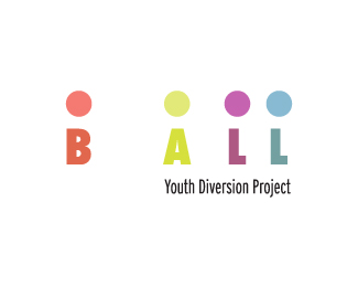
CYD Youth Diversion Project
by TernaciousT • Uploaded: Aug. 22 '08

Float
(Floaters:
2 )
Description:
WIP Logo idea. One of a series of Youth Diversion Projects. Each project uses an anacronym of the various area it represents.
Status:
Nothing set
Viewed:
2825
Share:
Lets Discuss
I like. But I wonder if the color breaks should just be on the bug with 1 color typo?
ReplyThanks. It's still a WIP so I'll see how that looks. You said bug but the icon is actually based on a tree, oops, I thought it was quite obvious. Cheers anyway.
ReplyClash is correct. I saw a tree. By bug I mean just the mark part of the logo not including the type. Might be an obsolete term these days. I'm dating myself again. The tree is great and reads as such.
ReplyI never heard it called that before. Learned something new! Cheers!
ReplyChanged type to just 1 colour, the 'bug' remains unchanged! %3B)*@gthobbs: I spent a good 15mins looking at the mark trying to see the bug you mentioned after reading your first comment! I think I even fooled myself into seeing one, funny stuff!
ReplyPlease login/signup to make a comment, registration is easy