innova
by TernaciousT • Uploaded: Jul. 26 '09

Float
(Floaters:
3 )
Description:
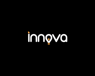
innova is a design consultancy business based on forward thinking and innovative solutions.
Status:
Client work
Viewed:
5400
Share:


Lets Discuss
Feedback please. The actual idea is pretty simple, the suggestion of candle in the 'i' and the light bulb in the 'o' %3D innovation, creativity, etc. Perhaps a cliche, what dayall think?
ReplyI like the thinking behind this one, Terry. I would probably have the 'o' in white and taper the bottom of it to represent a light bulb to make it more obvious. Could you also present the logo in a smaller size to make it breathe a bit more?
ReplyYay Feedback! Cheers Sean. I was planning on playing around with the %22o%22, I just wanted to know that I wasn't flogging a dead horse. Upload a new version soon with plenty of breathing space! %3B-)
ReplyInnovative !
ReplyI think the candle %5Bi%5D needs more of a %22%5E%22 point at the top of the orange graphic. Right now it just looks like a dot.
ReplyOriginally I just wanted it to be the dot suggesting a flame just by the slight angle applied, not necessarily a flame. I'll work up a new version based on all your comments, many thanks!
ReplyJust havin a coupla horizontal lines below %22O%22 would suggest bulb
ReplyI love the way you included the light bulb! :) Very smart!
ReplyPlease login/signup to make a comment, registration is easy