BALL Youth Diversion Project
by TernaciousT • Uploaded: Aug. 19 '08

Float
(Floaters:
0 )
Description:
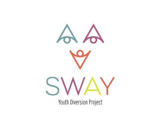
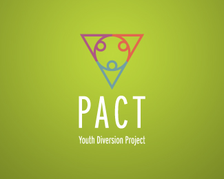
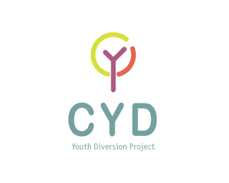
WIP Logo idea. One of a series of Youth Diversion Projects. Each project uses an anacronym of the various area it represents. Has to fun, colourful (using the colours shown) and playful.
Status:
Nothing set
Viewed:
2787
Share:


Lets Discuss
Ummm, I'm not very sure about this one but thought I'd upload it anyway whether the comments be terrible or not. Well I'm ready..... let me have it!
ReplyI think this could work better as just the type with the four balls above each letter, and get rid of the rest. I like the letter displacement. Not sure about the stroke around the balls mind... balls... Heh heh. :)
ReplyCheers Neil, thanks for the comment %26 advice. My problem is that I'm quite partial to a stroke around my balls, its a bad habit I know but I just like the feel of it.... enough of this Tom Foolery... :%5B)
ReplyPlease login/signup to make a comment, registration is easy