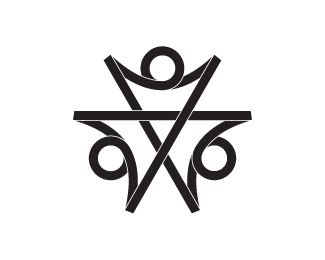
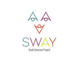
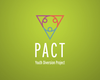
Youth Diversion Project Logo
by TernaciousT • Uploaded: Aug. 19 '08

Float
(Floaters:
4 )
Description:
Added colours and gradients to the previous flat version.
Status:
Nothing set
Viewed:
8298
Share:
Lets Discuss
Interesting, TT. If you look hard enough, you can even make out the first letters of each word in the name. The only thing that bothers me is, the people/youth shapes aren't as clear as they could be. But still, glad to see something new from you. :-)
ReplyCheers Kev. I took quite a few months off as I've recently moved from Ireland to Spain and needed time to settle in. But now trying to get back into the swing, the new 3.06 GHz Imac (4gigs %26 1TB, drool!) has helped to get me there. Thanks for your comments, I was trying to see if the letters might appear in the logo by fluke but didn't see them, glad you kinda saw something though. I'm still working on this one so hope I can improve it. Many thanks. %3B)
ReplyIf you remove a part of the yellow bar right underneath the top blue figure and then cut some slices out around the 'y' shape ( think of a lowercase 'y' ), it will be more clear. The 'd' and 'p' aren't quite as noticeable and would probably be a stretch, so forget I ever said anything about those. But hey, if you can get that 'y' in there, this might be more successful. Hope all went well with the move and congratulations with the new Imac. Cheers!
ReplyHi, i have a question for TernaciousT.
ReplyIm looking for a logo for my city's youth group, can you make a youth logo, and how much would it cost?
I like this one :)
@shakister I think you can reach him via his website http://www.tkbyrne.com/contact-us/
Reply@shakister many thanks and as Raja said email me at info@tkbyrne.com
ReplyPlease login/signup to make a comment, registration is easy