Description:
Purely for fun..
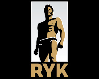
A logo for South African Olympic Gold Medal winning swimmer, Ryk Neethling.
(based on an uncredited photo)
Status:
Just for fun
Viewed:
7858
Share:


Lets Discuss
i think this would look great in just black and white - the gradient is right to me
Reply* the gradient is NOT right to me
Replyhermes, you're right - the gradient detracts from the simplicity of the logo. I like the gold though, as it adds a secondary branding colour, and works for both the 'Olympic Gold Medal' aspect and Ryk's name (meaning 'rich').
ReplyOK. Have uploaded a new version without the gradient. Much better IMO, so thanks hermes!
Reply:) no worries - I can't find the B%26W version :(
Replyapologies...when I actually use my eyes and read your comments, I see what you mean about the gradient hehe **nice work :D
ReplyAll your stuff is absolutely overwhelming !!! **I'm honored getting comments and how do you call it here ... floats (?) ... by you !!**Thank you so much and keep the masterpiece work up !!!!!!
ReplyThis one is really cool. I'm surprised it only has nine floats. The illustration is great – nice light/dark balance, and overall interesting shape.
Reply%22%25u2013%22 %3D en dash.
Reply%5EI totally agree. I love stark contrast illustrations like this. Very reminiscent of wartime propagandist artwork, and the current work of one of my favorite artists of this style, Aidan Hughes (the illustrator of all the KMFDM album artwork): http://bit.ly/aidan-hughes
ReplyHa ha. Thanks Jeff %26 atomicvibe. I was very tempted to float this one myself, as I was pretty chuffed with the way it turned out! Always interesting to see what fellow Logoponders respond to. There's some stuff I've done that I'm less proud of, but have received a lot of positive comments and floats. I'm sure that you guys have experienced the same?
Reply%5E%5E%5E%5E Suddenly figured out why - with Logopond dominated by male designers, any logo of a muscular guy in a speedo shouldn't get a lot of floats! %3B-)
ReplyFYI, male designer, married with kids and all that, ahem very very masculine, saw this and floated. There you go Sime %3B-)**Oh and loving the white striping around the speedos btw.
Reply%5E%5E%5E Well, at least you kept your %22package design%22 skills in the shadows here.
Reply%5E LOL! Classic comment.
Reply%5E%5E%5E Ha ha. Thanks for the float, Chanpion. You're definitely the man!
ReplyHey! Hey! The big S returns to the front page. Congrats brother!!
ReplyYeah, shadow work is a spot on. Great work Simon.
Replyklass)))
ReplyPlease login/signup to make a comment, registration is easy