Description:
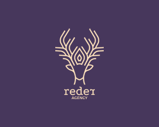
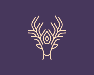
The client wanted a Reindeer for a wedding agency , elegant , big horns and a crown, the crown and the horns are connected togeather , and im still in progress
Status:
Client work
Viewed:
12026
Tags:
Crown
•
Horns
•
Reindeer
•
Wedding
Share:


Lets Discuss
This is nice work on the reindeer illustration, but the typeface seems disconnected to the mark in weight and style.
ReplyThank you very much bartodell , and i appreciate your critiques!
ReplyAnd much thanks for gallery spot:)
Logo is unused so i changed the font and name to
ReplyHonestly you need a typeface with more weight to it. The icon is bold and strong, while the text seems as though it was an afterthought in placement and size. Moving to a stronger slab-serif for example and adjusting the size of the icon in relation to the text would help this a lot.
ReplyThank you bartodell i appreciate your help very much , I changed again , now i think is better , i didn't spent to much time with typoface because the logo was unused but your critiques helped me :) thanks again
Replyreally nice one...
ReplyThank you very much Lijo
ReplyPlease login/signup to make a comment, registration is easy