Description:
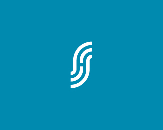
Personal monogram for myself.
As seen on:
Sean Heisler
Status:
Client work
Viewed:
16480
Share:


Lets Discuss
I haven't Sean and I like it! It perfectly reads as SH.
ReplyI have seen the %22s%22 with that style used many times, but never seen it used with the %22h%22 combo. I also knew it was an %22s/h%22 combo before even reading the description. cool.
ReplyThanks, guys, really appreciate the feedback. It's real simple and I thought I might check with the eyes here before making this permanent. Thanks!
Replynice, clever
ReplyThat's gold Sean, gold!
Replyclean flow. nice, sean.
Replyagree, very clever.
ReplySeeing this personal mark-to-be gives me great inspiration. I am amazed. Beautiful.
ReplyMmmmm.
Replygreat one, mate:)
ReplyThanks for the comments, folks! Really appreciate it. Working on transitioning from the ethereal name to just my name. Of the handful of concepts I developed this rose to the top and this is reassuring feedback, thanks again!
Replyhad a logo 'soundshop' in that S format, but it was to depict just the letterform S, pulled it down to work on it a bit more, but this is very very sweet, cool stuff sean.
Replyactually they are not a similar at really I'm talking crazy stuff! linky**http://i130.photobucket.com/albums/p252/pa74/Soundshop.png**thought I was tinking of rebranding myself as signum. but enought of that. cool mark man.
ReplyIf you stare at it long enough then, stare at white space...you get a ghost effect. :)
ReplyAh, I see, Paul. I like that mark, very cool. Don't abandon it! Thanks for the kind words.**@ Josh - Ha ha! That's my plan, I wanted something memorable that would burn into ones mind! If only I could make it last longer than 2 seconds. :)**
ReplyI think this can work Sean :) A little amazing too.
ReplyLove it. :)
ReplyIt's good.
ReplyMike, Josiah, Nikita, appreciate the comment.
Replygreat and simple
ReplyVery nice Sean! :)
ReplyThanks, guys. Long time, Michael!**FYI, I changed my moniker here from ethereal to my name, in case there is any confusion (if anyone cares!). :)
ReplyOf course we do, Mr.Heisler! %3B)
Reply%5E Ha! Thanks, buddy.
Replygreat stuff man, quite a unique style. cheers!
ReplyThanks, Stelian!
ReplyNice job, Sean. It works well.
ReplyGreat work Sean!
Replyneat and cool
ReplyHey mister, so you've finally decided to go with your name, I can clearly see S %26 H here, and also a road. Yeah, congrats on your new branding.
ReplyUff.. sweet simplicity. Great mark.
ReplySolid stuff, Sean.
ReplyThanks a ton, guys, really appreciate it!
Replygood stuff, Sean
ReplyI care! Great job. You are inspiring me to work on my own monogram.
ReplyGood strategic move Sean. Anyone will tell you, it's always nicer to hear an artists' name, don't you think?**Actually, no one will tell you, but it's a fact that if the above was said in Morgan Freeman's voice, it would sound so much more poignant...*
ReplyThanks, guys! **@ raja - hah! I can totally hear Morgan Freeman saying that! Hilarious. Thanks. Honestly, ethereal was just a name I thought of one day when creating a moniker, there was nothing behind it and it doesn't fit me and my work so it never made much sense. Don't get me wrong, I have nothing against burning incense and listening to Enya. :)
ReplyA very crisp mark Sean!Love it :)
ReplyThanks, Shyam!
Replyvery tasty!
ReplyVery clean and clever design Sean! Really dig it! :)
Replygreat stuff sean..
Replyhey sean, are we going to see this bad buy with type?
Reply%5E I meant 'bad boy' - damn these fat fingers.
ReplyThank you guys, really appreciate it. @Paul - hey buddy. Umm, I'm not sure if I will be applying type to it, I believe it may be more a stand alone monogram that can live on it's own but with my name set somewhere on whatever form of communication it is. An example might be on my web site at http://www.seanheislerdesign.com
Reply%5Eno problems Sean, great website btw.
Replygreat stuff
ReplyThanks, Colin, I appreciate it.
ReplyDig it!
ReplyThanks for all your kind words, Joseph!
ReplyThat's a creative SH.
ReplyCame back to see it again :-)
ReplyThanks, guys, I appreciate it!
ReplyClever
ReplyNice rebrand Sean.
ReplySreejith, Chrystian and Roy, mucho appreciation, fellas.
Replyvery nice:)*
ReplyThanks! Funny how this shows 108 floats, he he. Should only be about 63. Funny how it does that sometimes.
Replywell it should be 108! (:
ReplyHa ha! Thanks, Mike. :)
ReplyYou have a strong protfolio! Very nice work
Replyclever and simple ! good work
ReplyJustin and Carlos, again, appreciate your support very much! Thanks!
ReplyGreat Mark, Sean!
Replyas soon as I see this logotype I think how smart you are! :D*very very clever and nice work
ReplyThanks, Paul, mighty nice of you. As to the smarts, my wife would tell you otherwise.**Thanks, Alena.
Replystill one of my most faved monograms, sean.
ReplyThanks a lot, Colin, glad you like it. I appreciate the kind words my friend.
Replysuch a great mark! and a nice showcase too!
ReplyI appreciate the comment, Victor, and great work yourself, bud.
Replyou, great monogram. clever solution
ReplyGood one there.
ReplyLove your personal mark!:)
ReplyCongrats on the feature! Well deserved. Happy new year!
ReplyYou got a wonderful new year gift man... Well deserved.
ReplyCongrats!%0D*Happy new year! )
ReplyCongrats, Sean!*Happy New Year)
Replymassive congrats sean!!! was actually going through the featured designers yesterday and was surprised not see you already there. someone's picked up on my vibe, or i've picked up on theirs... weird! stellar showcase and one of my favourites.
ReplyCongratulations on the feature Sean. Have a great happy new year. :)
ReplyCongrats on the feature, Sean!
ReplyCongrats Sean, so well deserved and such a great news!
ReplyCongrats on the feature, Sean! Awesome logos....
ReplyI've expected it for a pretty long time ... congrats mate !!!!
ReplyCongratulations Sean! Great works and well deserved!
ReplySweet way to start a new year.. all the best, mate and congrats on the feature.. was about the time!
ReplyWell deserved bud, many more awesome logos for the coming year! Keep it up!
Replycongrats, i like your work :)
ReplyYESSSSSSS!
ReplyCongrats Sean! Way to Start off the New Year!
ReplyHappy New Year -- looks like it's going to be a good one!
Replywell earned, congrats man
ReplyCongratulations Sean!!*I was sure that you've already been featured but it turns out that you weren't. hehe %3BD*Happy New Year!
ReplyGreat things to come Sean, congratz bud!
ReplyCongrats Sean!! Well Done :)
ReplyCongrats, Sean! It's about time! :)
ReplyCongrats Sean. WELL deserved.
ReplyCongrats! Good begining of the year )
ReplyCongrats on the featured. Long overdue!
ReplyCongratulations Sean!
ReplyHappy new year, congrats
ReplyVery well deserved Sean! Congrats!
Replywell done mate. absolutely love your work!
Replygood one, super power synthesis
ReplyIt was only a matter of time when you will be featured :)*Congratulations, Sean! I am happy for you
ReplyWow! What a surprise and quite an honor! I really appreciate this and all the kind words from everyone, it means a lot. Thanks everyone and happy new year!
ReplyBOUT TIME! congrats buddy! Great start for your 2012, man. Well deserved. :D*cheers. Guess I'll go out and have beer for ya now!
ReplyCongrats Mr. Heisler. You've got some really nice pieces in you portfolio.
ReplyCongrats Sean! Great way to start off the new year :) I'm with Mike - gonna have one (or ten) beers for you now! Haha cheers my good man, enjoy this.
ReplyWell, well, well, look who's featured.
ReplyReally nice to open logopond and spot your monogram! Big congrats Sean, really deserved. All the best!
Replygrt going champ...well deserved...:)
ReplyCongratulations!
ReplyCongrats Sean. Nice way to start new year!
ReplyCongratz buddy, so well deserved (about time huh :D )
ReplyCongrats, Sean!
ReplyThanks again everyone for the comments, I really appreciate it very much hearing from each and everyone of you, it really means a lot. Thanks!
ReplyGreat work, flows very nice and the S H is easy to read.
ReplyCongrats Sean! superb showcase!
ReplyCongrats! Your showcase is one of my favorites...
ReplyThanks for the comments, guys, I appreciate it very much!
ReplyCongrats on the featured showcase, Sean! It's very well-deserved. You're a brilliant designer%3B keep up the good work!
ReplyJon, thanks my man, I appreciate that a lot and am a big fan of your work too.**@ Giedrius - Thanks for tipping the scales on this one and adding the 100th float, thanks! :)
Replynice to see a hundo next to this. i almost don't want to see it go up anymore in floats because it's so perfect looking.
Reply101 Congrats Sean!
ReplyThanks, Kamil! I appreciate. Thanks, Colin. I just want to give one last shout out to everyone again for the kind words and extend thanks for the honor of being featured, it means a lot, thanks so much. It's great to be part of a place with so much talent. Thanks!
Reply@ Sean ... SKYRIM ... level 22 ... what a game !!!
ReplyYes, amazing! I am level 29, it's nuts!
ReplyLove the intergration, great work.
ReplyI\'ve aways liked this!
ReplyHave always loved this icon. Brilliant branding.
ReplyLove this, Very clever, Congrats Sean!
ReplyPlease login/signup to make a comment, registration is easy