Float
(Floaters:
30 )
Description:
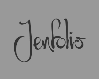
More refined version of the first one. For an artist/photographer.
Status:
Work in progress
Viewed:
4450
Share:


Lets Discuss
Here is the original:*http://logopond.com/gallery/detail/142682
ReplyIt is very tasty!
Replyagree ... that's really good ... brilliant !
ReplyThanks fellas!
Replydidn't know calligraphy was one of your skills ... want to see more of this ...
ReplyI read it fine. Looks great!
ReplyHey Bernd I'm not sure this required much calligraphic skill. I wrote out the original %22jenfolio%22 on paper, scanned it and traced it. But most of the calligraphic finesse was created from scratch via the pen tool. **Thanks for the comments and floats!
ReplyTerrific logotype, Sam!
ReplyOh dtf ... please ask my woman ... she's a calligrapher ... when I showed her your lettering sche said: beautiful unique work ... skills needed !**http://www.behance.net/gallery/Calligraphy-in-Packaging-Corporate-Design/371380
ReplyWow, her work is great! That means a lot coming from her then! Maybe I'll try some more calligraphy.
Replygood work here, sam.
ReplyThanks Colin.
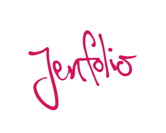
ReplyUpdated: fixed the J and colored her pink.
ReplyType is hers and logos are mine ...
Replyoptimization makes it great
Replyvery nice!
ReplyThank you guys.
Replyvery good lettering, very very good
ReplyI think it looks good!
ReplyPlease login/signup to make a comment, registration is easy