G. Graf restaurant
by Omnibusdesign • Uploaded: Jan. 29 '21

Float
(Floaters:
1 )
Description:
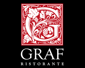
Logo design for G. Graf restaurant and wine bar
At the request of the owners of the Italian restaurant and wine bar G. Graf, the Omnibus agency designed the restaurant's logo. The concept of the restaurant is based on wines under the eponymous brand, produced in its own vineyards in the Italian province of Tuscany.
According to the agency's proposal, the first letter of the name-G-was to become a separate graphic element. Given the name of a restaurant theme aristocracy was asked to support use as a sign of initials, or monogram – stylized faces the first letter of the name. The monogram allows you to show the letter large and noticeable and, at the same time, create the right emotional feeling around it.
The graphic part of the sign is an "initial" - a decorated letter, which often began the text in old books. In this case, the initial is decorated with an ornament of grape leaves. This emphasizes the inextricable connection with the wine-making roots of the establishment. The sign has a wine-red color characteristic of ancient letters, in some cases it can be applied by stamping with gold foil.
The font solution is based on the Goudy Old Style font, created by the greatest font artist of the last century, Frederick Goudy. The font is based on ancient Roman font inscriptions and has a characteristic noble proportions of letters.
A bright, noticeable sign looks good both in a large size – on the signboard, and in a small size - on the menu and on napkins.
As seen on:
https://www.omnibusdesign.ru/
Status:
Client work
Viewed:
631
Tags:
monogram
•
bar
•
wine
•
restuarant
Share:


Lets Discuss
Please login/signup to make a comment, registration is easy