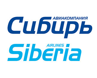
Description:
Sibera Airlines has firmly become one of the leaders of the Russian air transportation industry, having gone from a regional air carrier to one of the most advanced aviation companies in the country in the first decade of its development. In 1999, the company began to actively develop the international market, organizing regular flights to a number of major European airports. The image of the airline that had developed at that time no longer met the new requirements of the time. The work on the development of the new communication strategy of the airline was entrusted to the PR agency Infomost Communications, which in turn involved the agency Omnibus in the modernization of the visual image of the company.
The re-design of the airline's corporate identity had to take into account a number of factors, primarily economic, which significantly limited the ability to change the color of the aircraft, which largely retained elements of the old Aeroflot paint. Also, the airline's management did not want to completely lose the accumulated brand awareness.
As part of the project, the logo has undergone significant changes and a variant of the Latin script has also appeared. A brand-book was created, which included a completely updated corporate identity, updated aircraft paint, design of corporate materials, offices and places of sale.
Later, after 6 years, the image of the airline again underwent a radical change, including changing the name of the airline, which became known as S7. The world's largest branding agency, Landor Associates, was hired to carry out this work. But that's another story.
As seen on:
https://www.omnibusdesign.ru/
Status:
Client work
Viewed:
687
Tags:
Siberia
•
Sibir
•
transportation
•
airline
Share:




Lets Discuss
Please login/signup to make a comment, registration is easy