Description:
Development of logo design and corporate identity for the Chukurov Clean Windows window cleaning service
Development of a logo and corporate identity for a window cleaning service
Chukurov Clean Windows is a unique authors service for cleaning windows, created by a passionate person - Sergei Chukurov. Sergeys company serves commercial properties and private houses. In his business, Sergei focuses on the experience and style of work of his American colleagues. In Russia, the window washing industry is in its infancy, the service is perceived as utilitarian and is often performed by unskilled people, while in the west, especially in the United States, clean windows are an essential attribute of a successful business and a safe home, and serious people are involved in window cleaning. professionals.
Sergey turned to the Omnibus agency with a request to help create a brand for his business. One that would attract attention, be remembered and convey to clients all the scrupulousness of his approach to work. The work began with the creation of a brand name. Instead of the variants of abstract names proposed by Sergey, the agency advised using the creators surname as the main verbal identifier. This immediately makes the brand authoritative, one for which its owner is not afraid to take personal responsibility. We also suggested adding an additional descriptor - Clean Windows - to reveal the essence of the service. The English-speaking brand emphasizes the focus on high Western standards.
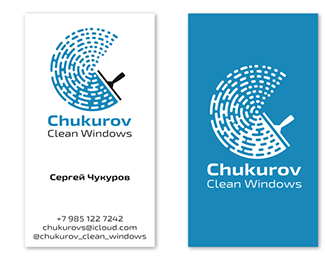
As a graphic element, the agency suggested using a figure that simultaneously resembles the letter C the first letter of the name Chukurov and the name Sergei and the trace of the circular movement of the squidge - the main tool of the window cleaner. The shape is formed by an interesting play of strokes, reminiscent of the disappearing trail of soap scum on the glass. The laconic white-blue-black color scheme of the logo and corporate identity supports the idea of purity and also emphasizes the seriousness of the business.
The agency also developed a design for branded clothing in the same color scheme. For the cap and jersey, a classic baseball cut is proposed, which is also a nod to American traditions.
As seen on:
https://www.omnibusdesign.ru/
Status:
Client work
Viewed:
1331
Tags:
window
•
service
•
cleaning
•
windows
Share:

Lets Discuss
Please login/signup to make a comment, registration is easy