Description:
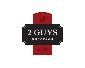
Wine blog created to reduce the barriers of wine, making it fun and easy to learn. This concept was not chosen.
Status:
Unused proposal
Viewed:
3935
Share:


Lets Discuss
I like this one, looks more like a wine label. But the other one looks more manly or something ... maybe that's better for '2 Guys' ??
ReplyI like this one also. It feels more related to wine.
ReplyI concur with both ryantoyota and rfrusso. I like the %22G2%22 at the top, but I read %22O2%22 (as in oxigen) at first.
ReplyVery elegant image Doc.
ReplyFor a blog, I prefer the approved one dOc.
ReplyThanks everyone.
ReplyPlease login/signup to make a comment, registration is easy