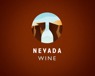
Description:
Dribbble.com wine playoff.
As seen on:
Ocularink.com
Status:
Just for fun
Viewed:
14956
Share:


Lets Discuss
blue wine, sky wine - cute)
ReplyThis is clever!
ReplyThis was my favorite of all those wine logos.
ReplyAlena, Rudy and Mike, thanks all of you. Had a blast playing around with these wine logos. We need another playoff soon!
Replyyes this one is great ... go ... make some proposals for the next tournament !!!
ReplyThanks, man! Gotta think about the next tournament...not sure yet.
ReplyEasily grasped and interesting graphic image!
ReplyGreat work Kevin!
ReplyWow my favourite wine logo so far
ReplyWine E. Coyote
ReplyIt's a canyon! No wait, it's a wine bottle!! NO WAIT...IT'S AN EMPTY WINE GLASS!! Oh no, better get the mules to bring down another couple of bottles.**Love this logo, by the way. Love it.
ReplyArtgeko: Thanks! effendy: Thanks, bud! cerise: Thanks for the huge compliment! logoboom: Ha ha, clever one! atomicvibe: LOL, thanks!
ReplyOHHH-YEAHHH!
ReplyThanks ! ! ! !
ReplyClever and beautiful!
Replyyeah 'western' wine, great :)
Replythis is AWESOMe
ReplyWow! This is a very cool! Incredible!
Replycool!
Replyvery nice, Kevin. and you can drink to that. !!!! %3B-)
Replyyeah i agree this is one of best beast from the playoff..
ReplyVery well done, good job
Replywoooooooow
Replynice one ! :D*
ReplyAMAAAAAAAAAZING!!!!!!! :X
ReplyMhm.. great :)
Replygreat color and clever :)
ReplyWOW! Thanks everyone for all your kind comments. Made my day!
ReplyTotally clever! This is great!
ReplyVery nice. Clean and great use of negative space!
Replyi'm very curious if the logo goes to the bottle :)
Replywow its amazing
Replyredheadllena, mandarine, damaraputra and sabb....thanks a bunch!
ReplyWow. So great. Best wine logo. Congrats for this beautiful work!
ReplyGlad you like it. Thank-you!
ReplyPlease login/signup to make a comment, registration is easy