by Nitish • Uploaded: Jan. 31 '10 - Gallerized: Feb. '10
Add to Pad (In 18 Pad s )
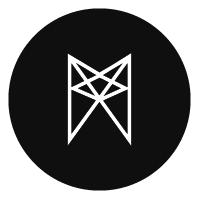
Description: sailing club...:) Status: Nothing set Viewed: 7232 Share:
love the darks look like the wave and the whole icon looks like a water drop :) lovely.
%5E%5E%5Ethx man..appreciate...:)
nice, but that means small elements that are poorly visible?
@bigoodis...which elements are u talking about?
on sail and in front of the ship.
the small details are only to give the mark (ship in particular) depth...without them it was looking flat...i fell tr is no need for enhancing the details...but thx for ur insight...:) appreciate.
This has a great look and feel to it. Nice work again!
thx again dude...:)
very very nice! congratulations!
thx icono...:)
very professional!
i dig it, good stuff!
@mattebersold*@felro**thx a lots guys
Like it.
Please login/signup to make a comment, registration is easy
Follow


Lets Discuss
love the darks look like the wave and the whole icon looks like a water drop :) lovely.
Reply%5E%5E%5Ethx man..appreciate...:)
Replynice, but that means small elements that are poorly visible?
Reply@bigoodis...which elements are u talking about?
Replyon sail and in front of the ship.
Replythe small details are only to give the mark (ship in particular) depth...without them it was looking flat...i fell tr is no need for enhancing the details...but thx for ur insight...:) appreciate.
ReplyThis has a great look and feel to it. Nice work again!
Replythx again dude...:)
Replyvery very nice! congratulations!
Replythx icono...:)
Replyvery professional!
Replyi dig it, good stuff!
Reply@mattebersold*@felro**thx a lots guys
ReplyLike it.
ReplyPlease login/signup to make a comment, registration is easy