Float
(Floaters:
9 )
Description:
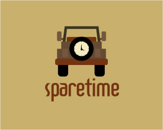
Logo can be used for any business. Doesn't have to be literal:)
Status:
Nothing set
Viewed:
2540
Share:


Lets Discuss
cute and fun
Replythx! it needs work....but not sure what to do with it yet:)
ReplyThe concept is nice, but you could try and simplify the mark even more, maybe a tad too much going on.
Replyi agree with choerte.. too much going on around the tyre/clock that the emphasis is shifted... try to simply and hone in on the clock!.. otherwise a nice idea...
ReplyThanks for the feedback:) I know what you're talking about...and I think it has a lot to do with the colors. When I drew the jeep originally it had more details than what it is now. If you look closely at the jeep, you'll see that the elements and shapes are quite %22simplified%22. I think what makes it %22complex%22 are the colors. I will revise and upload a newer version soon:) Cheers!
ReplyHi Patrix, nice concept. have you tried the jeep solid black and just a white outline around spare tire? Might even give the tire some tread? Or try another solid color? just my 2 cents.
ReplyHi Mike, thanks for your review. I just posted a revised version: %3Cp%3E%3Ca href%3D%22http://logopond.com/gallery/detail/49434%22%3E%0D*http://logopond.com/gallery/detail/49434%3C/a%3E %3C/p%3E
ReplyI like this color version. Translates best for me.
ReplyPlease login/signup to make a comment, registration is easy