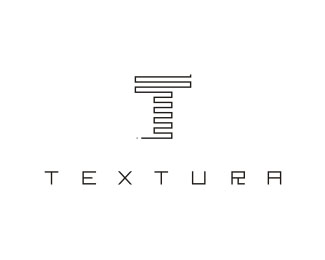
Description:
Fashion Brand TEXTURA © Muamer ADILOVIC DESIGN // MA:DE
Status:
Client work
Viewed:
26732
Tags:
Muamer ADILOVIC
Share:




Lets Discuss
I like the mark very nice. Clahsmore is right, that %22R%22 is a little bit annyoing it caught my Eye too.
ReplyThat's a great icon and a very nice logo!! I don't completely mind the 'R'. It gives the type treatment some character. However, in the other's defenses, the same effect could have been applied to one of the other letter forms and been a little less obtrusive.
ReplyYes, thats a good option ocularink! I think it also brings the typo closer to the mark and makes it more harmonic!
ReplyThis is plagiat. Look at this --%3Ehttp://www.orangeonweb.ru/logotypes/soldis.html
ReplyDefinitely agree with you there clashmore. No way that this is plagiarism in any way.**I think it's a great mark. I would have to agree with the others, though, that although the R is interesting, it really does bother me. Everything else just flows really cleanly and that doesn't.
ReplyWow. This is very impressive work. The R is a little interesting... but I like it that way. Very nice job on the mark.
Replynice one..%0D*R have some problem. already X is crossed.%0D*so R also having the same kind of cross line instead of having Lshape
ReplyCongratulations for winning 'best of Bosnia 2007' (EULDA) with this!...
Reply*Thank you nido and thank you all for the very interesting comments...*And yes that little r is interesting :) I try to have some connection between the typo and mark and that is the main reason why I decide for this kind or little r. I am OK with this little r... it is different but somehow that r gives originality to this logo. *...*
ReplyWhy little r when is normal R ???**lol :)))
ReplySo you know how it feels :) Lovely mark and typetreatment. Memorable
Replylol ...Yes :) Thanks, Action!
Replyvery nice, but I agree about the R as well... seems okay to have diagonals in the type, seeing as how there's an X there... and from the bottom of the main image, I can see you doing something more with the R, like trailing it off in one direction
ReplyPlease login/signup to make a comment, registration is easy