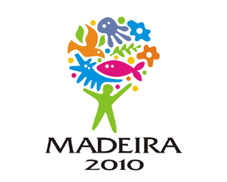
Description:
Logo for an environmental congress
As seen on:
Madeira 2010
Status:
Client work
Viewed:
7105
Share:

Lets Discuss
Don't think the type's a perfect match...but I love the mark! Very cool! :)
ReplyThanks Michael! Appreciate your commment!
ReplyChange that type!
ReplyThe mark seems a little bit out of balance as if it's going to fall over to the right side. That might be something worth working on. Also agree about the type, it doesn't feel like the right match. Perhaps something with less sharp points and angles would be a better fit.
ReplySomething real nice happening here, but I also agree on the type not quite being a fit.
Reply%5E%5E%5Eagree wid the masters above...jus to add...the hands could have a better symmetry, specially the left one...to heave on the left...:)
ReplyPlease login/signup to make a comment, registration is easy