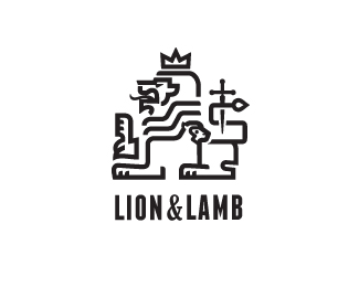
Lion&Lamb
by Mikeymike • Uploaded: Jan. 15 '13 - Gallerized: Jan. '13

Float
(Floaters:
63 )
Description:
an unused graphic direction for a school.
I still have plans for this one though down the road.
I was challenged to combine the lion and the lamb along with a cross/sword. I am working with another style direction for the final logo(crest) design, I'll post that when completed.
Status:
Unused proposal
Viewed:
9875
Tags:
revelations
•
religion
•
holy
•
jesus
Share:
Lets Discuss
this client got a hold of me because of these other design I had already designed for another client. http://logopond.com/gallery/detail/165836
ReplySo it has been a nice challenge to see if I can come up with another lion/lamb combo. Its been fun.
You are the one ... looks amazing !!
ReplyPretty rad, I like it. Maybe facing right?
ReplySneaky lamb
ReplyBernd, thanks, bud.
ReplySame goes out to you Dan. cheers.
Sam, I hear ya on the facing to the right. Its weird, but because the lamb is lower and then faces to the left it looks a tad off balance.
Maybe because we read left to right, top to bottom, I don\'t know, but it feels better this way. But then again it might be just me.
David, you might have something there. The ampersand added a tough of softness to the type for me. And the fact that there are some think and thin lines in the mark, it felt like it worked. But I may I may need to rethink it. Thanks, man.
Reply^oops..meant to say \"a touch of softness to the type.\"
ReplyMike how about adding the dagger as the plus sign=& it might clean up the design.
ReplyGood thought, Rudy.
ReplyPlaced the cross/sword in place of the ampersand. I think that works also. THX, Rudy. And you also, David, for making me take another look.
Replycheers.
cool call rudy. i like it mikey.
Reply^ ughh, that\'s *good* call.
ReplyVery clever. Very original.
ReplyColin, yeah I agree, maybe I should change out the two so the cross is the main image.
Replymight do that. Tanks! < ughh! I mean \"THANKS\"> (HA!)
orca, thanks goes your way also. appreciate it!
Cross instead of the ampersand really does look better, more consistent with the bold type & visual a reference to the mark, which is great for a type-only situation.
ReplyI agree, Josh.
ReplyChanged the main image to be without the ampersand.
Thanks bud.
Thanks again Rudy for the insight.
I think I prefer the ampersand.
Replymikey, you should have the cross break the baseline and extend to a point like you have in the mark.
ReplyG A L L E R Y!! THX.
ReplySam, I do like both, but this works cleaner and I think was a good suggestion to be More \"homogeneous\" as David puts it! :D
Colin, see what your saying, but I wanted to give the impression of a cross more than the sword between the words.
David. :D
Ever thought of making this a tee shirt? I\'d buy it.
ReplyThanks, Josh.
ReplyMight do that some day. I will let you know.
Wow, amazing!
ReplyTHANKS, JOHN.
ReplyPlease login/signup to make a comment, registration is easy