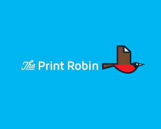
Thanks Bernd, Hossein and brandbros. yeah not sure on this one yet. like the look and feel of the type. feels to me like water, wake and the currant a fish leaves in the water as it goes by, but not too sure on the legibility. But like you mentioned Bernd, that may not be too bad a thing sometimes. Makes you design memorable. Cheers for the comments and floats peeps. :D


Lets Discuss
tiny is a challenge ... fish is great ... but ... imo ... a good logo could/should scratch our viewing habits ...
Replynice
ReplyGreat typo and balance.
ReplyThanks Bernd, Hossein and brandbros. yeah not sure on this one yet. like the look and feel of the type. feels to me like water, wake and the currant a fish leaves in the water as it goes by, but not too sure on the legibility. But like you mentioned Bernd, that may not be too bad a thing sometimes. Makes you design memorable. Cheers for the comments and floats peeps. :D
Replygood!
ReplyTHX Bernd.
Replyread it easily. very nice mark
Replythank you, Giedrius! :)
Replygreat job :)
ReplyTHX, pierro.
Replyhey haven't seen you around in a while. Things good? hope so.
cheers.
Please login/signup to make a comment, registration is easy