Float
(Floaters:
49 )
Description:
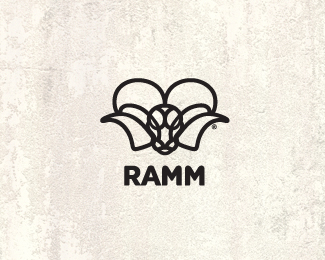
WIP. this isn't the real name, but just was wondering if its working.
Status:
Work in progress
Viewed:
5146
Share:



Lets Discuss
simple - clever - strong ... like it !
ReplyThx, Bernd. not quit sure on type, think it fits? I think the type matches the icon plus adds some strength to it. Thoughts?
Replymark looks realy good, but think need another type, this one looks too bold, and have very hard lines, unlike icon. but this just my opinion
ReplyI was wondering about that. thanks Deividas. But then again I liked the way it gave the icon a strong foundation. Still toying with it. Just love that font, I guess. thx for the response.
Replyi don't mind the typeface. It just looks like it's in a different color than the mark. It also looks very sharp compared to the mark. Smooth it out and fix the color and i think it's a winner!
ReplyWOW. that's odd, cause its the same color, black. maybe the type being bolder. thanks for the input.
ReplyDecided to stack the type. Also rounded off the type font a bit to closer match the icon. thoughts?
ReplyLooks awesome Mike, but it would look even more hot if it was only the RAMM. Now I know that you said it's a fictional name, but we'll never know until we see the 'real deal'. AKA, two line text throws it off a bit IMO :(
ReplyYeah, maybe for now that's the best way to get some honest feed back, cause I agree the stacked type is heavy. I'll reload soon.*thanks.
ReplyUPDATED: changed name and font. (simplified) (:
ReplyMissed this! Nice work, Mike. Didn't see the original font but this font matches nicely.
Replymuch better! even though I floated it before. maybe the font could be a little thinner, but that would be the only tweak I'd do. really like this.
Replythx, Sean.*Trish, yeah maybe a tad thinner. I will keep that in mind when and if they decide on a name. thanks for the feed back. cheers.
ReplySuper cool and awesome! Nice job!
ReplyLoving it. Nice improvement on the eyes. Gallery spot well deserved.
Replyrokis and julian, thanks for the comments.*And thanks for the gallery spot always an honor.
ReplyCongrats on the gallery spot, Mike. Well deserved. One of my favorites of all time.
ReplyBoom! Impressive job here.
ReplySimon, Jovan, thanks guys. Ramm on! (:
Replyreally great design
Replythx, cerise.
ReplyPlease login/signup to make a comment, registration is easy