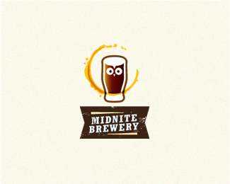
Midnite Brewery_V3
by Mikeymike • Uploaded: Mar. 23 '11

Float
(Floaters:
12 )
Description:
WIP#3.
Last one. other version at http://logopond.com/gallery/detail/132566
Status:
Work in progress
Viewed:
1816
Share:

Lets Discuss
Really nice. I don't think that the stars are needed though. They seem to complicate the form. Great concept.
ReplyI honestly think the owl is unnecessary. The moon/mug remnants is genius. This is good, but I could definitely see it simplified.
ReplyI have to disagree about the owl, its a great and uniqe concept don't kill the owl! The moon as a standalone wouldn't be that memorable and uniqe since there are thousends of them out there...**Love how you executed the owl into the mug!**The stars are too much indeed %3B)
ReplyMaybe it is worth to explore how to simplify the moon/stain? At the moment you have kind of two different styles (owlmug is clean %26 moon is grungy) The moon distracts a bit from the ingenious owl/mug concept imo
ReplyI'm also thinking if you seperate those two elements you have two outstanding concepts! 1st concept %3D one mug/owl which looks great as a standalone too //%26// 2nd concept with the moon stain perhaps one star stain? (the star could make a difference between other stain logos) :)
ReplyLooking over what Alex said, I have to agree with him. Each could really stand alone. Great advice Mr. Wende!
ReplyThanks guys for the feed back and discussion.*I have updated this concept without the stars below the type. It did clean it up.*Alex, I do have another concept here http://logopond.com/gallery/detail/132537*I used only the beer stained moon and added a few small stars and took on a grunge label.*I feel this one does need both the beer stained moon and the owl in the beer just to keep it fun. I don%3Bt mind if someone has to look at it awhile even thought the styles do clash a bit. Just my thoughts.*thanks again.
ReplyPlease login/signup to make a comment, registration is easy