Midnite Brewery_V2
by Mikeymike • Uploaded: Mar. 22 '11 - Gallerized: Jun. '11
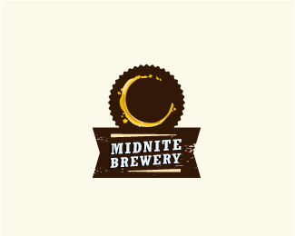
Description:
WIP_V2
other can be seen at http://logopond.com/gallery/detail/132537
Status:
Work in progress
Viewed:
3721
Share:




Lets Discuss
Oh wow.. So interesting and nice looking, Mikey
ReplyMe likes!
ReplyThanks Deiv, pierro and lefty. it is cleaner than the other one. We'll see what my buddy says this weekend when he see's the concepts. cheers.
Replyahh much better
ReplyGreat concept! :)
ReplyMaybe try the top border less Reese's?
Replyluma..I'll give that some thought. maybe just too many. but i still want that older beer label style. little more research. thanks.
ReplyYea, I think it is the color combined with that number and depth of ridges.
ReplyThats great Mike! :)
ReplyNice concept Mike!
ReplyGood stain concept!
ReplyI really like the idea of the stain on a coaster that is also a crescent moon. If it is a coaster the top should just be round.**If you want to stick with the ridges try having a 21 point star. That is usually the number of ridges on a bottle cap. You could even round them off a little like a bottle cap.
ReplyThanks for the Gallery spot. And thanks for all the nice comments really appreciate it.*@ mrshonuff, good advice. My freind is looking at the owl version for the final direction, but I may have to go in and tweak this one some more later. thanks.
Replygood job
ReplyThank you, Moises for the comment. much appreciated.
ReplyNice one. The gallery seems to be moving quickly lately and I missed it.
ReplySooo clever Mikey.
ReplyDevey, rudy, thanks guys always nice to hear from talent like yourselves.
Replywow, realy clever..
Replythanks, Deividas.
ReplyPlease login/signup to make a comment, registration is easy