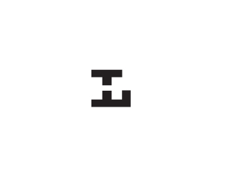
Description:
does the Hand L work better here? and has this been done. I have seen things close, but different letters I think.
Status:
Work in progress
Viewed:
2053
Share:





Lets Discuss
other concept can be seen at http://logopond.com/gallery/detail/126872**see both letters better here? thoughts?
ReplyI kind of want to see both bottom and top parts of the 'H' the same height...like where this is going though Mikey.
ReplyUPDATED: thanks Joe, don't know how I missed that one. :)
ReplyWith this solution, T letter pops out even more. Intended?
Replylove it, Mike!
Replyworks much better
Reply%22T%22 for thought, Alen. Thanks.*thanks, bigoodis.
ReplyI this works great too, Mikey.
ReplyI like this better than the other idea. Subtle yet definable.
Replythanks, Sean. You too, Jedah. Still giving this some effort.
ReplyI like it. Reminds me on the logo of Berlin airport%B4s duty free shop: *http://news.fluege.de/wp-content/uploads/images/fluege/2010/08/F-Handgepaeck_003_klein.jpg
ReplyA little maybe. That is a nice %22H%22 and %22G%22 design , thanks for sharing, Asasello.
Reply%5E%5EI wouldn't worry about that Mikey, two completely separate concepts. Looks good.
ReplyWhat is the guy on that photo doing exactly? :)
ReplyBetter to read HL
Replymikey what is this fo?
ReplyPlease login/signup to make a comment, registration is easy