Description:
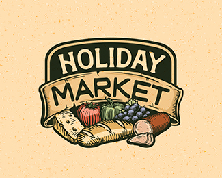
Modified and repurposed an unused illustration to create a new look for this local market.
Status:
Work in progress
Viewed:
10150
Tags:
produce
•
woodcut
•
farm
•
food
Share:



Lets Discuss
Rad illy!
ReplyThanks! This was a fun one to tweak and add color to.
ReplyClassic! I got so excited when I saw this. Are you using anything other then the pen tool, shape builder, gradient, and probably pathfinder? Trying to learn from the best :).
ReplySuper!!!
ReplyThanks! Will trade tips for floats. :p Hahah. But honestly, I have a very specific process, but I'm fairly open about it. I can give you a breakdown but it would take up too much space in this comments area. Feel free to email me if you'd like and we can discuss.
ReplyGuess we posted at the same time, Piotr. Thank you!
ReplyNice man!
Reply@Biondic - Thanks!
Reply@Massarh - Honestly I am pretty new here as well, but no I haven't been featured. I'm not sure what the rules are, but I think you probably need to have a more substantial showcase and more gallery adds to be considered. I really appreciate the thought, though. :) I am glad that people are finding my stuff inspiring, though, that is the goal!
Also, there is no set definition of a 'real designer', and there is no badge or piece of paper you get when you become one, so don't lower yourself. You are creating design and I can tell you have a good understanding of the process. Just keep on pushing your own creative limits and growing. :)
Jess, just keep pouring phenomenal stuff and you are almost there i am sure!
ReplyGreat work !
ReplyThanks Bojan, I hope someday at least! Thanks Sam!
ReplyGreat Job!
ReplyThanks, Kaimere!
ReplySee? I've told you :) Congrats, well deserved Jess!
ReplyHahah - WAY sooner than I had even hoped for. Thanks!
ReplyFeeling hungry looking at it!
ReplyPlease login/signup to make a comment, registration is easy