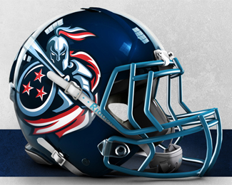
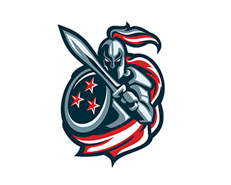
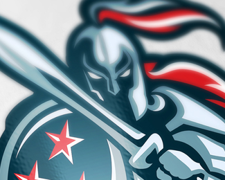
Titans
by LuBeraDesign • Uploaded: Jan. 20 '15 - Gallerized: Jan. '15

Float
(Floaters:
58 )
Description:
A logo for a sports team called the Titans, originally made as a rebrand for the NFL Tennessee Titans. I have lofty aspirations to rebrand the entire NFL as a side project.
Status:
Just for fun
Viewed:
33598
Tags:
mascot
•
sport
•
sports
•
football
Share:


Lets Discuss
Something I like but couldn't make!
ReplyLooks great on the helmet, but no type = no gallery.
ReplyThanks! Sam - I'm defying the odds. :) I have a version with type, just never bothered to upload a version with it. It's pretty standard sport logo stuff that I just didn't feel was going to do much either way. I will make a note to add that when I get home. :)
ReplyAlso, honored by the gallery spot! I'm glad this one is being enjoyed.
ReplyFor the record, I don't agree with the no type = no gallery rule.
ReplyI've kind of always felt that way too, but it's
ReplyDavids choice.
Is that why this became ungallerized? :( C'mon guys, no takebacks!
ReplyAnyone remember the Titans?... used to be on the homepage.
ReplySorry, Jess, same thing happened to me.
ReplyWell, I updated with the preexisting copy. Your call. Personally I think the mark should be able to stand alone, mascots look awkward when text isn't built into the team logo. Just imho. Thanks!
ReplyI like it but rules are rules, although you added the type, let's see what happens.
ReplyIt's really on me for not understanding that the rule was in place, I respect the fact that it had to happen.
ReplyBut to be put up there, and then have it snatched away in my moment of triumph! That's just heartbreaking, hahah. I'll stop running up the comments and just be patient I guess. I appreciate the fact that many people seem to like it, I am fond of this particular piece. 'Twill always be gallerized in my heart. (Cheesy...)
I love this. With and without type. But, now that it has type, it certainly deserves a gallery spot.
ReplyThank you Tabitha! And thanks to the powers that be for putting it back up. Sorry about the whining, I'll know next time!
Replyoops. I think that was my bad. most of the time I agree with the rule, too, but with sports logos they seem just as complete without full out text as with.
ReplyLuBeraDesign, You're welcome and... you're welcome. ;)
ReplyTabitha: Oh, it was you? :o Plot twist!
ReplyJess, two girls gallerized your logo. Tabitha, does that mean we are fighting over him, his design, in a weird artsy, laissez faire way?
ReplyI want to comment in a few ways to that... but I'll play it safe and simply say that I hope you'll both feel free to continue the fight over my future submissions! Hahah. But thanks regardless, it's always a thrill to see a new piece on the front page.
ReplyThis freakin ROCKS. I have a soft spot for sports teams mascots, and you've done a great job on this one.
ReplyThanks, Atomicvibe! I have always loved sports logos but haven't done many. I plan on redesigning the entire NFL someday as a fun side project. Currently stuck on the Saints.
ReplyClimax: I do understand your reasoning here. It seems to me that sport logos fall in the middle to a degree, but I understand that you can't reverse the rule for a handful of logos that will be the exception. Honestly I believe my text is too simple, but I suppose it generically fits the mold. I should probably spend a lot more time on the text to compliment the image. :)
Titans are back in the town ;) well done Jess.
ReplyThanks Radek!
ReplyI finally got around to creating more fitting type for this one. Just looking for opinions on the additions and color preferences, I'm interested in some feedback though this was really just a for-fun project. :)
ReplyPlease login/signup to make a comment, registration is easy