Description:
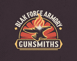
Logo created for a blacksmith and gunsmith.
Status:
Work in progress
Viewed:
4755
Tags:
guns
•
armory
•
gunsmith
•
blacksmith
Share:




Lets Discuss
Hmm I like this. It's big, bold and almost explosive. From the main website when I first saw this, the design almost looked like a man with his head aflame, running. That's probably just me though, hahaha. Good job!
ReplyThanks Mason, I appreciate the compliments! Haha, I hope that isn't the common impression! I might have to run a survey on that.
ReplyHaha, looks like I have some tweaking to do. Not the message I want to convey. Actually I've been planning to make the anvil a bit less horizontally elongated, that may help. Thanks!
ReplyPlease login/signup to make a comment, registration is easy