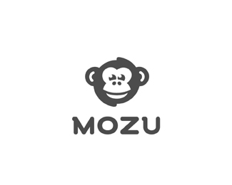
OneFund
by Logomotive • Uploaded: Mar. 24 '10 - Gallerized: Mar. '10

Float
(Floaters:
97 )
Description:
Logo done for OneFund. Not chosen.
Status:
Unused proposal
Viewed:
45321
Share:


Lets Discuss
Looks great Mike!!
ReplyThanks Alan, client did not think so :) well thought it was too understated.
ReplyThanks Anthony, how it goes. Logo design ain't easy %3B)
ReplyTimeless solution and great design. Too bad.
Replytoo bad for them. this was nice solution.
Replyvery smart. and memorable. too bad.
ReplyThanks guys, I admit it's a bit of a let down. Guess it was not the right solution.
ReplyWhat's the chosen proposal? May we see it?
ReplyWell a combo of an old one I did along with clients idea? will be on onefund.com best I can say at this point.
ReplyI designed the US One logo the star will be used with a version I did for client.
ReplyI like the subtly! It's a shame they didn't go for it.**I have a niggling question about the perspective.*If the top left and bottom left corners of the 'F' are trailing back towards a vanishing point (creating the '1') then the underneath of the arm and center-bar on the 'F' should be trailing towards the same vanishing point. No?
Reply%5E the F would not be noticeable. Hope I answered your niggling question
ReplyYou could have the vanishing point lower than center, that would fix the perspective and keep the F within the white-space legible.
ReplyOk thanks for your advice. I'm gonna stick with my perspective here considering it's a done deal.
Replyyeah no worries, it's more hassles than it's worth, it looks cool as is. Fixing the perspective would alter the ideal shape of the 1 and F anyways.
ReplyOK um you have made you point like a few times K. I kind of know how to design a little bit, so sometimes I just leave it. Maybe I'm not there yet? Still learning.
ReplyTake it easy dude. You're a much better logo designer than I am, but dodgy perspective is dodgy perspective, I studied technical drawing, was just trying to help.
ReplyAnd you don't think I know perspective and what works in Logo design? Your theory would not work here and something I had already thought of. K?
ReplyForget about it, I'm sorry I pushed a button.
ReplyNo just a lot of gurus these days...... if that is my button than yes.
ReplyNot chosen? Only reason I can think is that they were looking for a wordmark...looks great Mike.
ReplyTrue that the bars of the F couldn't follow the 2 point perspective of the 1 but the bottom of the 1 could follow the 1 point perspective of the F.
ReplyJoe thanks. Glen ya know what, that makes a lot of sense. I think I originally had it that way and cannot remember why I changed it.Think it had to do with giving it more perspective :)
ReplyI imagine OneFund's target audience isn't going to give a flip about perspective. Sometimes it's okay to break the rules.
ReplyShame on the client for not liking it. it stands out so much!
Replyrules are MADE to be broken!
ReplyA good one, the thing is. The persective of the F doesn't match the 1.**I rlly like it though
ReplyReally nice use of negative space. It is a shame that it will not be used as it is a fantastic logo.
ReplySimple and objective. I like.
ReplyThe subjectivity of concepts Mike, for some could be simple and understated, for some genious, for me... I'll go with the second choice. Their loss.
Replylike it a lot! clear and so strong. love your work Mike!
Replylove it!
Replygood job!
ReplyThanks guys. Thanks for your perspectives.
ReplyLovely. Such a shame the client went in another direction.
ReplySweet! A pity they didn't choose this. Well, their loss.
Replyhow do u nail it every single time! damn!
Replyhold the hammer right? Sometimes I hit my thumb.
Replymissed this guy! How do you do it?...
ReplyThanks designabot.*This was the one they went with www.onefund.com*Guess this one could still be used down the road, no loss here. For something like FirstFund or sumpin.
ReplyGeez, I can only assume the chosen one was heavily influenced by the client. Doesn't even look like your work!
Replyohhh dear.. sum times client really deserve a kick!
Replysave it for our First Fight... dont worry... you wont be required to do a second one... you wont be here %3B)
Replyit's ok. Good client and he knows his audience better than I do. The other one works fine. *Keep training nav, keep training.:)*
ReplySomething NEEDS to be done about this. I feel a lot of people are losing interest in this site. To the spammers U R pathetic. What a waist of time on YOUR Part. Get a life.Nothing is being accomplished here at all.
Reply%5EI'm barely at this site as of recent Mike. I simply cannot take the spamming anymore, it's completely out of control now. Rummaging through pages and pages of unruly, unworthy comments was bearable when this started, but I've just lost patience with it. It's sad because I really like this site, and it's a shame to have to move on to others. Hope the problem gets fixed because LogoPond just isn't the same anymore.
Reply%5EI understand your frustration David. As a visitor to the site it is very troublesome, can't imagine the annoyance as a site owner. I haven't checked the forum regarding this topic...is there one currently going? Can you allow users to delete (or hide) comments on their logos while this spamming issue is occurring? I'm just thinking out loud.
Reply%22short of approving each and every comment%22**That would indeed suck :P I don't know, it's a head scratcher...doing that would fix the spammers, but would kill the flow of comments/debates %26 potentially cause identical comments.**Hmmm...I do like Joe's hide/delete idea but I can foresee that feature being abused i.e. People removing critique (however valid it may be) because they can't take it.**What if there's a timing system? Say...2mins between commenting, might help the rapid spamming sessions that've been happening.
Reply%5ERegarding the deleting/hiding comments...I don't think it would be a problem, because going to what you said about possibly deleting a %22critique%22, users can accomplish this anyway (in a sense) by red flagging the design so nobody can see any comments. I think myself, and many others, would agree that being able to delete comments of their design would be great and slow the flow of spammers. Although there is a possibility of abuse with this system too, it sure beats the hell out of pages and pages of spammed comments.
ReplyThat's true...forgot about the red flag :)**What about a 'flag user' system?**If a user is spamming or being abusive, etc. the flag user button is pushed %26 they're temporarilly blocked till their comments are reviewed by Admin %26 then appropriate action is taken...
ReplyI believe David needs more associates to take some of the 'delete/ban these spammers' duties off his shoulders. Or, a delay in allowing people to post comments. Only approving the new members' abilities to comment after they've been a member for 2 months. That'd do it.
Reply%5EBut then the %22spammers%22 can start using that against us and temporarily block us. It needs to be something that only benefits the non-spammers...maybe a %22report as spam%22 button can be put in place next to every comment automatically when a user posts - when someone clicks the %22report as spam%22 button the comment is hidden. Anyone else with ideas? The more heads the better...
ReplyI believe you and I posted at the same time, Joe. You're commenting back at someone else with that last comment, correct?
ReplyHey David, if you want/need someone to monitor the spammers and be in charge of rifling through the comments and deleting the spam, I am fully up for the duties.
ReplyYes, JF...that was aimed toward Josh's comment.
ReplyThing is, with my idea of allowing more ppl to delete/ban spammers...it'd have to be a power only used with spammers, no other level of 'delete power' allowed. It could easily be abused.
ReplyGood to know, thanks JoePrince.
ReplyThis is good, all the pro's %26 con's need to be put on the table...that's the only way the problem's gonna be solved :)
Reply%5EOh yeah of course, that's the idea. All I know is something NEEDS to change. It's only getting worse, and without changing or implementing something it's going to continue to grow.
ReplyI don't want this to get covered and not seen...what is everyone else take on this spamming issue?
ReplyWhen a new account is registered, limit that account to viewing and floating only for a period of time and later allow uploading and commenting. Will a spammer wait around for a week or two for an account to be validated? I suppose it could backfire and frustrate legitimate users as well. Just a thought...
ReplyI support the %22delay%22 feature, because it can't be messed with or %22gotten around%22%3B people simply have to wait, and spammers HATE to wait. They're desperate folk. Only allowing commenting after 12 images are uploaded is too easy to be abused. And I say %22images%22 bcause...they will likely not be real logos. Or logos at all. The delay feature is closest to foolproofing of all ideas mentioned, as far as I can see. 2 months would be a sufficient amount of time. Anything less is still too soon imo.
Replyhttp://pondpad.com/forum/viewtopic.php?id%3D4587
ReplySorry for the discussion on your design Mike.
Reply:) I really don't care either way, just feel That's where David likes to address it.
Replyhmm a report button is definatly a must imho, especially for copycats here on logopond (like the user which copied my honolulu filmfestival), maybe a CAPTCHA-Test could help also to reduce the spam?
Replyvery nice mike
Replyvery nice
ReplyPlease login/signup to make a comment, registration is easy