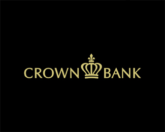
CROWN
by Logomotive • Uploaded: Sep. 11 '09 - Gallerized: Sep. '09

Float
(Floaters:
55 )
Description:
This is a logo I'm working on and still i the rough. I liked the concept but client going another direction. Will try to convince them the branding potential I see in the design.WIP...
Status:
Unused proposal
Viewed:
10726
Share:

Lets Discuss
Hey Mike, I think the design is awesome. Very creative. However I can't really see this on a bank statement or a sign. Don't get me wrong I love the design, I think it's really cool and I'm defiantly interested in seeing other mock-ups.
ReplyThanks Bud, I think it has potential maybe eliminating one row might help simplify. Thinking.....
ReplyBTW, my thoughts with the design is the Intricate detail you see on bank notes, money etc. figuring out a way to convey that demonstrating growth while maintaining simplicity. I have seen more Intricate bank designs than this however.
ReplyIt looks very good, it reminds me of the patterns over the banknotes, my only doubt is that it has to many details, as logotivity noticed quite difficult to be reproduced on some materials, but otherwise i think, as you said in the description, the branding potential is huge. Congrat on the project and good luck with the customer!
Replythanks Tass,Yeah taking all into consideration... I think it's one row too tall for starts.
ReplyNima thanks bud, that is actually the most appropriate comment I think I have heard form you... humm
ReplyI see the crown but the perspective is sort of bugging me a bit I think. Fitting explanation you gave behind it, though.
ReplyI agree about the perspective. Perhaps reducing the height will help too. Definitely a great direction though and a nice mark. Hopefully your client will agree.
Reply%5E I agree WIP. will be improved though just wondering if it's worth perfecting, since client is opting another direction. Thanks for input guys.
Replythis has a very modern feeling, mike. i like it.
ReplyI see the potential as well Mike, it is unique and versatile for applications.
ReplyIt's certainly got promise...and I definitely like what you've done with it thus far. Looking forward to the rework if you do decide to go ahead with it. Cheers!
ReplyThanks so much guys, it's big one so got to get it just right regardless if they choose this version.
ReplyLogomotive, please, please forgive me for saying this -- I really like your work -- but, the crown appears to resemble a tiara more than a crown to me. I think it is the small line that is to signify the bottom of the crown. The jewels lack solidity, so I see no 'top' on the back end of what would be a more weighty crown-like look. I assume I'm in the minority here as far as that impression goes. **Still a neat design%3B like the graphics work.
Reply%5E Thanks Thinking....
ReplyJF like I said thinking... Considering a Tiara is also a sort of crown I don't think that's so bad. Why does it have to be 100%25 masculine. I see more of a masculine presence here yet has a little femininity. Could be the best of both worlds. Probably ot going here anyway but interesting convo.
ReplyI really like how ornate this is.
ReplyNice
ReplyIt certainly has branding potential! Looks good.
ReplyThanks frendz.
ReplyMike - I like this a lot. I have to be honest, I think it's solid and don't have any beef with this at all. Nicely done my man.
Replyvery nice.
ReplyI agree with logotivity. The mark is light and intricate, but it is also fragile and even playful looking for something with a _trust_ in the name.
ReplyDid you update it? If not, my eyes are playing tricks on me because it looks much better.
ReplyVery elegant but yet strong. Love it.
Replythis is really cool. only one minor tweak...if you draw a line through your oval crown opening it appears that the right side is riding just a tad higher than the left. almost seems that if you rotated the detailing of the crown one 'tick' to the right (independently of the oval) that would remedy it and make it prefectly symmetrical. Classy mark!
Replynicely done
ReplyThanks guys, this will mostly stay the way it is client choosing another design which is more traditional.
Replythat's a pity, great design nonetheless
ReplyHey Mike, very applicable/brandable stuff here! It's a shame they didn't...
ReplyYeah it's cool though. They're the ones paying the bill and the ones that will live with it. I think there final choice will be ok.
ReplyLOL NIma there are probably 10K crown designs.
ReplyI like it a lot. I think that the typography is excellent. But I also agree with Logotivity... this logo doesn't fit in the category of banks.
ReplyVERY NICE
Reply*always cool :)
ReplyPlease login/signup to make a comment, registration is easy