Float
(Floaters:
118 )
Description:
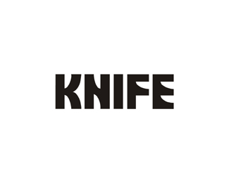
Knife Logo type. Just Sharpening my skills ;)
Status:
Nothing set
Viewed:
25543
Share:


Lets Discuss
Concept is good, but the difference between the neg. space knives and the poss. I is bugging me. I'm a fan of subtly, so i would like to see just the %22I%22 as the knife and the rest of the letters normal. maybe create a cut line on the bottom (just a thought)
ReplyNot sure I understand Your neg/pos theory. looks ok to me but thanks for the comment.
ReplyReally nice custom type design, boss.
ReplyI'm guessing Gaard meant the difference in widths of knife blades in the neg space of K and N.*
Replysharp...
ReplyI was trying to suggest looking at just the letter I holding the shape of the knife. My eye is drawn to that part already and I think the knives in the negative space of the other four letters is overkill of the idea, which I still enjoy! my suggestion is to see only the %22I%22 holding the shape of the knife and nothing else. Keep up the good work!
ReplyThanks guys, the beauty of the design imo is the negative space and that was the whole purpose. I guess perhaps because I'm a type designer I see things differently.If anything I would change the I not the other way around.The only thing that bugged me was the fact that I could not do anything with the lower part of the f %3B(
Replyha fixed the I. Got me editing some older work %3B) for the best I guess.
ReplyCool...as for the lower part of the F...maybe...a knife blade pointing downward a bit past the baseline.
ReplyVery cool - it took me a few seconds to fully appreciate it. Might make more sense if it was pluralized though (knives).
ReplyThanks Fab, Thanks Siah sounds like some challenges to perfection %3B) I might have to entertain your thoughts... This was actually just a an old typeface I worked on where I noticed the N looked like knives and made a logo out of it.
Replygreat as usual
Reply%5E%5E Thanks!
ReplyMan this logo is sharp %3B)
ReplySpitze!
Reply%5EHa! Right on %3B) Sharp logo indeed!
ReplyThanks for the comments.
ReplyThis definitely makes the final cut. Awful pun, everyone was ahead of me with the puns. Cut it people!**Great work Mike.
ReplyThis is so good.
ReplyHa Farmhill kinda dull but funny. Thanks Chad.
ReplyI think one knife in one letter, maybe the F, would be enough.
ReplyIMO that would take the beauty out of the actual custom typography and the whole concept of using negative space.
ReplyI'm loving it. :)
ReplyThanks Premal 123.
ReplyGreat concept. I've done a logo knife a while ago: http://logopond.com/gallery/detail/109933
ReplyGreat Work as always
ReplyAwesome! Just stared at it for some 5 minutes.. can't find anything wrong with it. Great one.
ReplyClever logotype! :)
ReplyThanks My friends!
ReplySuperb
ReplyI can imagine how much fun this would of been to design when the concept came to you. Wonderfully done mike
ReplyWorks a treat.
ReplyPlease login/signup to make a comment, registration is easy