Description:
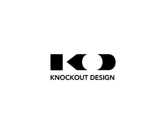
KnockOut Design. Pencil K O D concept based on more of the Old School way of actual Knocking Out (reverse out).
Status:
Nothing set
Viewed:
10190
Share:


Lets Discuss
Thanks Sour %3B-)
ReplyI really like this one and the O is a good knockout :)
ReplyClean and simple...from one old schooler to another.
Replyi think giving the impression of knockout with the reverse out... is a really clever concept.
ReplyAnd to the point!
ReplyThanka guys. Who ya calling old glen? 40 is the new 30 now :-)
ReplyI didnt see the pencil or the D, until you mentioned it. But I understood the concept.
ReplyHave you seen %22OK tire%22:http://www.oktire.com logo. Not saying they it's too close, but there's certain similarity.
Reply%5Eumm.. OK but not sure other than the fact that they both have an O and K :-)
Reply@epsilon.. are *you* ok???**nice work Mike!.. really know how to %22knock em out%22 huh?.. %3B)**
Replylol :) Respect the Old School!
Reply@nido and @logomotive - as I said they are not close, but they both _do_ have O, K and a pointing thingy built playing off K's shape and so there's is certain conceptual similarity. Not implying anything whatsoever, just an observation.
ReplyI'ts OK but how else do you make a K? it has a natural pointy thing :-) just thought it a strangely unnecessary comment that's all.
ReplyWell, i am apparently full of these comments recently. Just thought that being aware of that other logo could've come handy in some cases.**In any case, it is a very clever logo. Few things are going on as usual and they all are cohesively combined in a single seamless piece. I wouldn't change a thing about it ... not that you care :-)*
ReplyI really love this. Floated (which I do fairly freely) and faved (which I do very rarely) as well.
Replycheers Trish, ya made my day. :-)
ReplyLOL! Knockout comment from nido %3B) Nice Mike.
ReplyClever, really like it. Good job.
ReplyHa waiting for trick or treaters while reading old comments, thanks guys.
ReplyHi logomotive *I need to talk you in private because i like what you doing and need you help and idea for my logo .*Best regard
ReplyWongef, sorry just read this. Contact me. See my profile for contact info. Thanks
Replyoops that was 2012 not 2015. My bad
ReplyI missed this one Mike, it's awesome.
ReplyThanks Rudy!
ReplyPlease login/signup to make a comment, registration is easy