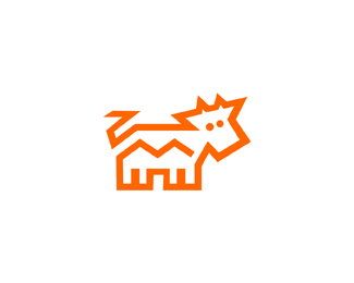
REDFOX
by Logomotive • Uploaded: Oct. 07 '08 - Gallerized: Oct. '08

Float
(Floaters:
89 )
Description:
REDFOX.
As seen on:
www.logomotive.net
Status:
Nothing set
Viewed:
35852
Share:


Lets Discuss
really like the simplicity and abstractness - great job logomotive
ReplyThis is awesome, reminds me of a childhood game i used to play
Reply%5E%5E Thanks guys, @chng. yeah I know what your referring to, those white and red blocks that we matched up in kindergarten%3B-)
ReplyWAW WAW WAW! I like
ReplyAmazing design Mike!
Replyas usual, great!
ReplyI was just messing around with my Tangram puzzle set the other day. Nice idea.
Replya tangram! yes thats the name of the game!
ReplyVery nice!!! Logomotive, you got a very good portfolio.
Reply%5EThanks guys.*Tangram huh? did not know what it was called.
Replyfantastic mate!..
ReplyIt's actually quite fun and relaxing. :-)
Reply5 sharp. :P *Love it, Mike. Works really well at thumbnail size.
ReplyGet da F outta here! Awesome!
Replyhttp://forum.theovc.org/viewtopic.php?id%3D258%0D*%0D*To bad the whole concept is stolen. Maybe you should try figuring out your own ideas before you go stealing other peoples hard work.
Reply%5E Hey Pal, don't go accusing me of stealing anything. WHY don't you check out my portfolio and see for yourself that I don't need to steal anyones ideas. As GOD as my witness I have never seen that logo or anything close to that. So I guess nothing new under the sun has been done huh. I know for myself the truth and sure others believe me.
ReplyAnd by the way it's usually the other way around. I'm always chasing pirates ARRG! except they blantantly RIP my stuff, this is purely coincidental, honestly.
ReplyYou know this really ticks me off. Let me explain in details here that This started off playing around with 5 of the same triangles (notice the angles). The fox was accidental and I was not actually trying to design a fox but I arrived at this and,.. well red is a common fox color and name so thought it was appropriate. Mine is simpler and different and it is MY hard work inspired by myself. So there.
ReplyEase up there Morgri. Feel free to draw a parallel and show a potential conflicting design. I'm sure logomotive would WANT to see it, as any of us would. But before you go casting aspersions you might want to take a look at the person you're slandering. It's not like logomotive is some hack that doesn't know his way around logo design. We're ALL (ok not bart) chasing him on the top uploaders board. You try to go out and create 216 logos without a coincidence like this happening. You do this for as long as we have and it'll happen...more than once.*But like I said, PLEASE DO point out similar designs. We all want to know so we can see if it's coincidence or if maybe WE'VE been ripped. That happens all the time too. Just do it with a little respect when you're dealing with an accomplished designer like logomotive. He deserves it. Peace.
ReplyThanks Glem, I need some napkins now.
ReplyP.S. Logomotive's fox was posted October 2007. The one you reference was posted as new creative September 2008.
Reply%5EGlen!
ReplyOops...that last fact was incorrect. That's me looking at dates at 12:30 a.m.
ReplyYes i agree im a new member but been looking on the pond for years. In design sometimes things do share the same pantone and or company name but in my opinion as Relevant said the logo from the other site really has nothing on this.%0D*%0D*Great work Logomotive.
ReplyMikee, Miguel, you don%B4t need to give explanations, (tu no nececitas dar explicasiones). Your work speaks by itself, (tu trabajo habla por si solo)**Maybe the concept it%B4s a little similar (tal ves el concepto es similar) but i think the critic was very aggressive. (pero creo que la critica fue demasiado agresiva)**Cheers mate, exelent work as usual!!! Saludooos n_n**
ReplyWOW. this is what i mean for a beautiful logo!
ReplyGeez...
Reply‘...Its like comparing Picasso with a finger painting’ great phrase! jejejeje!
ReplyI'm sorry, I may have been a little to hard on you logomotive. It might have been a coincidence or might not. It just seemed rather uncoicidental that you would get the same name, colorscheme, and similar idea as the guy on the ovc. But then again, coincidences do happen, and appropriation is a very fair idea.
ReplyAlso, don't get me wrong, your stuff is really good. It just be a reallly reallly close idea compared to the other two who had posted in the ovc.
ReplyReally nice concept :)
ReplyThanks guys, maybe I should just stick to my %22illustrative%22 work %3B-) it's hard to be simple (geometrical) and not have it done before, but to be honest it never even crossed my mind that anything would be close to this, but then probably just about every animal has been done in this orgamish like style.This just pushes me to try harder he he.
ReplyYeah, I think you should pull your socks up and try harder next time %3B)
ReplyFunny how the majority of people accusing RIPS never have any logos uploaded here. Shame.%0D*%0D*Anyway, this one whilst similar to the one referencedis far and away better. Flawless execution as per usual. A tip of the hat, sir.
Replyxcellent work.. i like it verymuch
ReplyBTW, it is obvious how this design came about. Was this done whilst working on the forward click? Same scenario as Go Fish? S
ReplyThanks rambal*@ gareth, yeah sort of both of these were done 11/2 years ago the fox was never refined and needed work on the head I fixed that and decided to upload both. Thanks
Replyvery nice and simple love it.
ReplyMogi dont be fixing it now, you bluntly acussed him of stealing other peoples hard work, now that youve been proved wrong for talking before getting your facts straigth dont try and fix it accept that u were wrong as bluntly as u acussed someone u didnt know and apologize
ReplyChng!, I hardly know what facts I have wrong. For I we know it's his word against mine. Sure, because he's been a logopond a while you'll probably believe him over me, but the fact remains that it his word over mine. There is absolutely no evidence presented by him that shows that he came up with this concept without some really close influence from the poster at the ovc that I is linked. %0D*%0D*Granted, the two, are, after the finished product quite different%3B However, it just irritated me a lot to see someone else long time work at a different place by a different poster. Now, seeing as logomotive will continue to say it is a coincidence I will take him by his words, but again only he knows the truth.%0D*%0D*Still, I have not been proved wrong in anyway.
ReplyYou see that is you sticking to your statements, thats how you are suppose to be Good for you! i dont want to extend this more than what it already is but that poster, the shapes the type solution the depiction of the animal. (dude or dudette) they look nothing alike, ill have to re-read the post to see where the designer states copyright and owner ship of the color red, the animal Fox, the animal fox being red, the triangular shape, Origami arts, and tangram.**and congratulate them for the genious of coming up with such a creative, unique and completly extravagant name of red fox, considering how foxes are blue purple and green right. **but as you said we should come up with our own ideas before stealing other peoples hard work specially one with so many copyright issues
ReplyMorgri, whatever!!!! had I posted the fox online when I posted my Fish/Forward Click logo over a year ago, we would not be discussing this. Why don't you step out from under your little morgri shell. I NEVER want to be accussed of stealing!! GOT IT%3E Because I don't NEED to jerk.**%5E%5Ethanks anyhow chng!
ReplyYou know if I had the task of designing a fox in which I'm only aware of 2 colors red and grey DOH! I probably would have never cam up with this VERY simple geometrical shapes, but flipping triangles around trying to shape an F fro forward Click I had 4 triangles and I said %22hey that looks like a FOX%22 so duh I named it red fox. wanna come look into my hard drive?
Reply%22'Tis better to be vile than vile esteemed%22
Reply%5E%5Ebut not that vile!
ReplyId like to know the background of he company in a few words.*I like the mark though..
Reply%5E%5E Thanks guys. It is what it is.
ReplyWhat is the background of the company?
ReplyOr is this just for fun? for yourself, playing with shapes , colors, and names?
Reply@gynemeth, ya pretty much so. :-)
Replyyep, congratulation !
ReplyFantastic!!!!!
ReplyThanks guys, the comments from you guys are appreciated and lets me know that you understand, just because it looks simple does not mean it is. It was a wonderful accident of shapes that just so happened to fall into place at the just the right time. Cheers!
ReplyVery nice. **Not sure about the ear though .. it just looks disproportionate and kinda awkward. One option is to make it smaller and move it a bit up%3B another - rotate clock-wise by 22.5 degrees and perhaps make it smaller too .. though either of these may look as awkward :)
ReplyThanks, I hate to sound arrogant but it's perfect the way it is. The fox is looking away (perspective)
ReplyI was staring at it for a couple of minutes and I am not seeing the %22looking away%22 part. In fact it now started to look more like a unicorn to me :)
Reply%5E put on your glasses.*
ReplyOk fine. I've seen it and admired it as a thumbnail for long enough. Love it. Love the fox. Love that he's looking away, love the text and I LOVE TANGRAMS!!!! I had a royal blue set in a little square cardboard box. Awesome.
Reply%5E yeah you made my day. I love you %3B-) don't tell your hubby.
Reply@logomotive -**I see it !! :) It *is* looking away, just as you said*But I'd be damned if it's obvious.
ReplyThere's so much love in this pond!
ReplySo Hindmarsh, I think there's not enough...
ReplyI've shared plenty of my %3Ca href%3D%22http://logopond.com/gallery/detail/42417%22%3Elove%3C/a%3E with you Alen 'Type08' Pavlovic
Replysmart.
Replythis is so inspiring, and such an amazing logo!
Replycome to my favourite :)
ReplyThanks for the love.
ReplyLooks like I have a fan? Plagiarism? **http://logopond.com/gallery/detail/50459
ReplyLess is more though LOL!
ReplyRight here on LP, now that's a class act! glad to inspire ya.
ReplyJust unbelievable!
ReplySomehow I doubt that David posted it without realizing it would stir a controversy.
Reply@ Epsilon LOL! yeah right!
ReplyThanks Toni, yeah I grabbed it also. I appreciate your support bro.*This one is a bit touchy for me. It's a favorite of mine.
Replylol, I saw it also..
ReplyI didn't even bother to look it was so obvious. I knew you guys would take care of it.
ReplyALL my other logos are game! just don't mess with my RED FOX! :-)
ReplyI'm copying at least 3 of your logos as we speak. Shhhhh.... Keep it on the DL.
Reply%5E LOL, I meant ridiculing.mocking or critiquing but yeah got your point.
ReplyToni, you ROCK bro. If there more Toni's there would be zero piracy. This man gets the job done. never mess with Toni or his logos. thanks bud.
ReplyWow .. I assumed all along that the ArtFox with a mock logo made out of spite. I guess you guys have a juicer %22history%22 than meets the eye ..
Reply%5E what is he suppose to say? no argument.
ReplyWell we are trying to resolve the issue guys, so hold off on the comments for now. I have been in contact with the owners.*Toni check your email.
ReplyHi, I'm Raphael from ArtFox, after discussing with both designers I decided to take down the logo and evaluate my options. I certainly do not want to offend anyone. You can read more on our decision on Bolideas blog: http://www.bolidea.com***Thank you
ReplyRalpheal well for one I am very offended. After reading your link I'm even more appalled. If you really wanted to do the right thing, you would have done what I have asked. First on the Market is irrelevant here (what hire a designer that ripped another design? before that design was made for sale?).**Now First %22Published%22 is the copyright issue and copyright law. **There is no debate or discussion here. I do appreciate that you did take the logo down but providing this link adds to the fire.**I'm willing to work this thing out end all and even red flag my red fox if we can work together here.**I'm at No falut here.
ReplyI' will take this to the end if it kills me.
ReplyIt's funny to me that in the article they say that a logo doesn't make or break a brand yet they continue to drag this out and are still pondering using Dache's logo. By doing so they are just making their brand look worse. Someone please make sense of this for me.
Reply*Mike's logo
ReplyThanks lundeja, and to all that have understood and supported this cause in which you should all be backing IMO if you plan on making this a career.
ReplyIt's funny to me that in the article they say that a logo doesn't make or break a brand yet they continue to drag this out and are still pondering using Dache's logo**LOL that's what I have been trying to figure out. Scratchin my head. maybe I need to get my eyes checked I might be missing something.? **I always thought less is more and KISS? but maybe I'm wrong here.*
Reply%22Finally, while ArtFox could have done without this episode, the logo certainly does not make or break a company…the product and the team do.%22**ARE YOU KIDDDDDDDING ME?**If it doesn't make or break a company than why have one in the first place? I'd be interested in how much they paid for dache's services and they I would ask them if it doesn't make or break a company than why did you spend ___ of money on it.. Just an unprofessional comment from a unprofessional company..
Reply%3E ARE YOU KIDDDDDDDING ME?**This blog is a part of the damage control measures they are implementing to counter all of the negative PR ArtFox managed to accumulate so far. One of the goals of the post is to try and disassociate themselves with the damaging subject and that's the only purpose of the closing remark. It's a PR management 101. I wouldn't spend too much time dissecting it.**Also, if you look at whole situation from this angle, it's obvious that they have exactly two choices - **(a) drop the logo and ideally try and make the whole incident look as an accident, i.e. try and remove any negative associations that the logo f*ckup created for ArtFox. They can also go as far as changing the name of ArtFox, but that could be quite expensive depending on how far they have advanced in marketing it.**(b) try and discredit Mike and push forward with using dache's version. This option is very risky as it can very easily backfire and permanently stain not only ArtFox, but also Bolidea and David's reputations as well.**All in all, it still looks to me as an intentional provocation on David's part. There is no way he could've been unaware of the RedFox logo. Also considering some remarks Mike made in his direction, I'm going to guess they have a %22history%22 between themselves and this incident is just a very dumb and unfortunate escalation of it. **So if I am right, then the only civil way to end the whole thing with minimal collateral damage is for David to produce some sort of an apology and for Mike to accept it. Though probably neither of them is prepared to do that.
Reply%5E at epsilon, good observation, however I am willing to accept and move on. This whole thing will be forgotten about if they accused just do the right thing and all links will be broken, but it's snowballin now because we have stubborness.
ReplyIt's nothing compared to the link posted. This is more elegant and classy, and as far as I remember triangles are not copyrighted!
ReplyDache did not do his research. Pure and simple. Regardless of whether he was knowingly or subconsciously 'inspired'. That makes him initially at fault. That the ArtFox owner did not then require Dache return his money and then buy Mike’s logo, or require Dache to design a completely new logo for no additional charge I do not understand. (Or that Dache did not offer those two solutions himself.) Those were the only two option once copyright infringement is confirmed. As quick as the owner thought he was in reacting to the news, he must not have been that quick, because the only reason I can think of that he did neither of those things, is because he’d already dropped a bunch of money on print with Dache’s logo. Well, someone at ArtFox could have done the same research Dache should have done. Simply run some descriptive and key words through a search engine. Such a quick and simple exercise would have saved all parties embarrassment. Is Dache a good designer? Yes, without a doubt. Was he stupid in not doing his research. Yes, again without a doubt. Doesn’t matter how good you are, how old you are, how experienced you are, how knowledgeable you are, mistakes happen. Sucks it was this public for all. But then you are never too old to learn from and pay for your mistakes.
Reply%3E I wrote this on their blog:...**I don't see it.
Reply@epsilon They turned on comment moderation after mine and Toni's comment. It may never show up.
ReplyThanks for your support. that's the problem with blogs. They are sometimes one sided with moderation.**Look here http://logopond.com/forum/viewtopic.php?id%3D2530*I posted this in the forums prior to dache posting his logo. I said what my favorite logo was provided by a link. So for those of you who still think it is coincidental may want to rethink that theory.*ARRRRR
ReplyThe sad thing is I'm willing to negotiate a deal, red flag, remove or have any comments removed via blogs. Stubborness is the problem here, some people cannot be wrong I guess.It's just going to keep snowballing if people do not cooperate.
Replywell if you look at the dates in the blogs and the time I posted to the forum, I find it hard to believe that he %22forgot%22 about Redfox. too short of time.
Reply%5E Duh, Mike, you don't say.**Bolidea released a bunch of comments from the moderation queue. Given the content of some of them, it actually took some balls to do that.
Replythey don't want the wrath of logomotives army %3B)
Replyi've only been on logopond for a short time and I respect and admire both dache and logomotives' portfolios. Usually when someone is accused of plagiarism on logopond, they come out and usually say %22no, i didn't, it's a coincidence%22 or sometimes they say %22yes, i was inspired by your design%22. I agree with Climax, to not hear anything from dache is disconcerting.%0D*%0D*Just my 2 cents. Hope you find closure on this logomotive.
Reply%3E Bolidea released a bunch of comments from the moderation queue. **And now at least one comment is gone. There were 16 comments this morning, and - 15 now.
Replydache has always been a shady cat - some of you are only learning the half now - maybe some of you have wondered why I always give him a hard time ***
ReplyI once warned dache. Don't go stepping on peoples toes. He ignored my suggestion and I did it out of sincerity because I thought he had skills and was a good designer. He just stepped on the entire design community IMO.
ReplyHoly crapola!
ReplyI’d like to apologize to Raphael from ArtFox and to Bolidea for designing a logo that is similar to Mike Erickson’s RedFox. It was clearly not my intention. I did not do enough research and in the end it was my mistake from which I have learnt.**Most importantly, I’d like to apologize for all the trouble and bad publicity this incident has caused. I also thank ArtFox, Bolidea and Mike of logomotives for efficiently dealing with the situation. You didn’t deserve this.**Again, my apologies to all parties involved.**---**For d10 I was requested to provide stylisation of an existing logo. As I was not involved in the design and production process of the initial logo, I think that the discussion of copyright should be taken up between the designers of dreamten and Bionic systems. Incidently, the logo that I stylised, the one on logopond, was not used as they felt their existing branding, the one they have on their website, to be efficient.
Reply%22like to apologize to Raphael from ArtFox and to Bolidea for designing a logo that is similar to Mike Erickson%22**big of you to apologise to the clients.. why not a direct apology to Mike?*
Reply%22Again, my apologies to all parties involved.%22 is not good enough!**this has to be said.. you need to apologise direct to MIke otherwise this looks like a classic case of dache a%24%24 kissing his clients (yet again) but not man enough to apologise to Mike!**thats an insult to designers man!.. are you so far up your own butt you cant see that?.. you come on her %26 apologise to your clients???.. email them!.. come on here to apologise to MIKE!
ReplyI feel like I gave him (Dache) an 'out'. Sorry Mike.
ReplyTo clarify my previous comment, I wholly apologise to Mike of logomotives for any inconveniance caused during the process of this issue.
ReplyI'm trying to cut back on sugar, but I sure could go for a twix.
Replydache, I hope this thing is coming to an end. i apprecaite the fact that you actually responded. I am Mike my business is Logo's and my business name is Logo Motive Designs. I also go by the name Logomotive here on Logopond. I am not Mike of Logomotives and you know that I AM CERTAIN. I will think about this and respond when I feel comfortable that this is a sincere apology.
ReplyBy the way a personal email might help this situation HUH?
ReplyThese are the days of our lives
ReplyI'm glad to see this fiasco resolved at last but I didn't like the parting shot 'Mike of Logomotives' I can totally see why that rankles.
Reply:-) I'm glad someone caught that. he did another time.
Reply%5E HOLLY cow can you believe it. I cannnot
ReplyCan you spell S T U B B O R N. at least he goes out fighting I will give him that.**ME*Mike of Logo Motive Designs*AKA LOGOMOTIVE ( for dache)*
ReplyOK Toni, The GF part is overboard for me bro. Love ya but not in that way K?
ReplyOH k just want to clear that up don't wanna be someones lil B. :-)
Replycheetahs? the only cheeetah I know of is dial 1 800 d a c.. still have no email apologies from either party.
ReplyOK Bolidea and dachea, I need to get this stuff in writing here. Please contact me via email.
Reply%22C'est la vie%22
ReplyBTW everything worked out in the end. Water under the bridge now.
ReplyI did receive apologies from parties involved.
ReplyJust SOLD this puppy. I'm a bit sad but happy he now has a good home. Redfox Inc.
Reply***** SOLD, SOLD, SOLD ** Congrats on your sale, keep up the great work!
ReplyThanks it's kinda like letting one of your %22babies%22 get married. :)
Reply%5E yeah, well, don't feel bad about it, it means it's still yours. just that other people are having fun with it. :D
Replyand man this is like the longest comments thread on the pond.
ReplyI just stumbled upon this, a very dramatic read and no doubt a very unfortunate incident. I hope it's all sorted now. Great logo!
ReplyThanks!! WOW This was a story.
ReplyThought I would unredflag, since I have nothing to hide.
Replyclassic ... :)
Replythanks JandS still one of my personal favorites.
ReplyIt's Sold! Sold? Sold! Done deal. I can design a new one for you??
ReplyPlease login/signup to make a comment, registration is easy