Float
(Floaters:
3 )
Description:
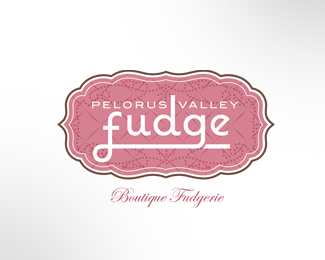
Second identity option for boutique fudge producer.
Status:
Nothing set
Viewed:
3648
Share:


Lets Discuss
I prefer this mark over the other one you've posted. Nice work. My only comment would be about the pink color as it may limit your client base.
ReplyHey Big Al, what about pulling up the f and g, moving fudge up changing to a 2 tone brown and reducing the pelorus valley type? might give you a better composition? and would allow for Boutique fudgerie to be tucked under the f/g. Just some thoughts.
ReplyThanks for the comments and suggestions... ironically, the client went for the other option posted in my showcase but this was my fave.
ReplyPlease login/signup to make a comment, registration is easy