Peter Baker Apparel
by LloydCreative • Uploaded: Sep. 11 '08

Float
(Floaters:
12 )
Description:
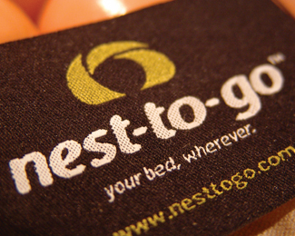
Logo for independent apparel buyer and supplier.
Status:
Nothing set
Viewed:
3791
Share:


Lets Discuss
nice. i like it.
ReplyNice but there must be problem with print (non vector logo)...?*(sorry for my bad english %3B)
ReplyThanks for the comments. Mishka - nothing wrong with your english at all and you raise a good point. While I would normally create most of my identities as vector images, sometimes creating something with a heightened degree of realism and three dimensions can in fact result in a brand that has far greater impact. It draws the in viewer and invites them to look closer. In this case the clothing tag was the right approach that added to the tactile nature of the business. The beauty of this identity is that it only ever reproduced in CMYK in print (stationery and business cards) or rgb on the web. The client has no need for signage which would not be such a problem these days anyway with large format colour printing making such brands easy to reproduce on signage.
ReplyI think your totally right BigAl. As you say i think its a creative new way of putting the logo out. As long as its in line with the demands of the client. Great work!
ReplyI have a question for you. When designing a logo like this that isn't vector what's the best way to set up the file so that you still get a hires logo that would be big enough incase they wanted signage? Thanks for any help.
ReplyCashmerejm... I've found you basically want to create the original image at the largest physical size at the highest resolution practical. So, in this case, you might want to have something around 60cm wide x whatever the depth comes to and at 300dpi. Most large format digital printing doesn't usually require the print file to be that higher resolution - you can usually get away with 150 - 200dpi with the image resized to the dimensions you need it - this is because you are never usually very close when you view larger signage. But even for trade show banners (you know, the pull up ones) you'd get away with having the file around half the finished size required as long it was high enough resolution and you'd be able to enlarge the image within your layout programme without there being any obvious loss in quality.
ReplyHA! I knew I had seen this somewhere! I was looking through Letterhead %26 Logo Design by Rockport just yesterday and that logo actually stood out to me but I couldn't remember where I saw it before. I went back to the book and found it. Anyway, great job on this. It obviously worked on me. I think maybe because you don't see many logos that aren't vector so it made me stop and think about it.
ReplyThanks for the comments Michael... appreciate you looking in.
ReplyPlease login/signup to make a comment, registration is easy