Description:
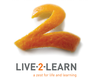
Identity for a professional corporate training and motivational company. Featured in 'Really Good Logos Explained' by Rockport.
Status:
Nothing set
Viewed:
4080
Share:





Lets Discuss
Looks like a bitmap. Not really practical... Also the shadow behind the 2 is way to dark.
ReplyI kind of like it - minus the harsh drop shadow, though. I think it's a nice idea to incorporate the %22zest.%22 Possibly try centering the tagline and justify it across the width of %22live 2 learn.%22 Good job.
Replyinteresante!!! si sus medios de impresion son digitales o via internet, no creo que se vea muy bien en blanco y negro, posiblemente lleguemos a utlizar imagenes de este tipo en un futuro proximo con los avances tecnologicos, por el momento creo que esta limitada su reproduccion, eres atrevido al darlo como resultado final, interesante :)
ReplyThanks for the comments. The peel is in fact a CMYK image created by actually cutting the skin from an orange (no stock images in this baby)... in order to infuse some genuine reality and depth into the identity rather than relying on digital filters and tricks to create perspective. The shadow was that generated in the actual studio photography (including the texture of the white surface not visible here), hence adding to the sense of depth and perspective and giving viewers the illusion that the peel was there for the taking. As for its use in black and white - something I'm pretty strong about for any identity - this one was solely created for use in full colour print and the digital environment where the restrictions of black and white weren't applicable.
Replyok! felicidades, estas rompiendo las reglas y lo estas haciendo bien, se me hace interesante la propuesta de utilizar la fotografia como medio para crear un logotipo, creo que es lo mas valioso de tu aportacion, saludos
ReplyIt really stands out. The whole bitmap thing is always a concern, but who says bitmaps won't make a comeback.
ReplyWhat does it look like if you take the shadow out all together, I like how you have combined the 2 and L.
ReplyThanks for the comments people... I think removing the shadow would defeat the purpose of having an actual photographed image and possibly make it less dimensional? Anyway, the bitmap identity is a rarity today and I rarely use them, but I reckon they can still be effective when well considered and carefully applied.
ReplyPlease login/signup to make a comment, registration is easy