Description:
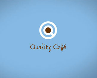
The goal was to create the corporate identity for this “coffee shop”, which sells varieties of high-quality coffee. The company’s initials shape is a coffee cup. The brown centre of letter “Q” can be used as colour codes on the packaging. Different shades of brown colour indicate the type of coffee roasting in the cup. The colours of the rings on the saucers offer three colour variations indicating different areas of this company.
Graphic Design Categories Winner of "The promise of years of creative" Visual Arts Project and Exhibition, 2010 Hungary, BKF (Budapest College of Communication and Business)
XVII. National Biennial of Graphic Design Exhibition, 2010 Hungary
As seen on:
www.behance.net
Status:
Unused proposal
Viewed:
5703
Share:
Lets Discuss
Nice presentation
Replythanks Vergad!!!*was a lot of work.
ReplyPlease login/signup to make a comment, registration is easy