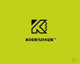
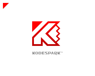
KODESPARK
by Kode • Uploaded: Feb. 08 '09

Float
(Floaters:
1 )
Description:
This is a revision to my brand prior to launching a new version of my website.
With the new version of the site, I hope to create a more intuitive interface as well as feature case studies of all my projects.
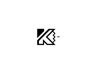
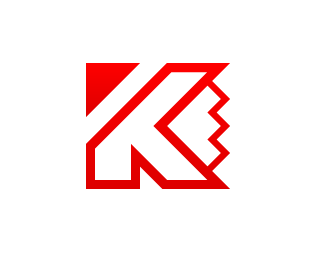
The revision to the brand features a Single color mark, Slightly modified typeface.
The mark is a combination of K, Pencil tip (right), Pointing arrow (left top)
This revised version of my brand is currently being use on my twitter page
As seen on:
KODESPARK
Status:
Nothing set
Viewed:
2164
Share:

Lets Discuss
I would really appreciate some feedback guys!
ReplyI am not digging the type. **For one, I think the special treatment of A and R overloads the logo. The mark has a lot of presence on its own, so for all intents and purposes the mark _is_ your primary brand ID, so there's no need to create competing branding element in a form of a text.**For two, E looks funny.*
Replyjust curious... what is the arrow signifying?
ReplyWhat is the zig zag bit on the right...not sure what it is. Quite a nice looking symbol though.
Reply*@epsilon* You're right, the mark is my primary brand ID, I didn't want to use a generic typeface because I'd like to use both elements independent of one another for some branding applications. If you have some ideas on how I can improve the typeface, I would really appreciate it. Thanks for the constructive criticism!***@indiview* I wanted something to hint at my web development expertise but without breaking the mark, so the arrow is sort of an abstract mouse pointer.***@cerise* The main goal of the %22zig zag bit%22 was to hide a pencil tip within itself to hint at my graphic design expertise. If you pretend you're holding a pencil horizontally and try to push it into the right side of the K you might see it!***@Relevant* Most people that I give my business card to say the same thing, which is great: ) Sometimes a logo doesn't really show everything it's supposed to, but for me as a creative individual it's important that it's there, even if at first is not obvious!**I want to *thank you* all for the support and encourage you to share you thoughts, comments and/or suggestions!*If you're on twitter, feel free to leave your *url* so I can fallow you!
Replythis logo reminds me with kasper antivirus's logo
Reply%5E yer but its better :P
Reply*@RAY2008* It was a concern of mine but the mark represents everything I wanted to portray, I would hate to have change it you know!***@indiview* Thanks bro, that's very nice of you!
ReplyPlease login/signup to make a comment, registration is easy