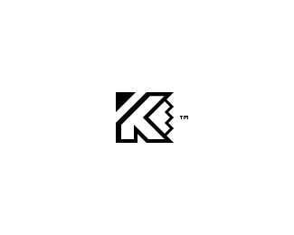
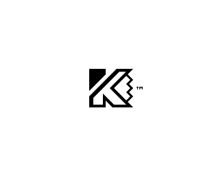
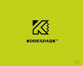
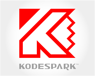
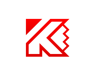
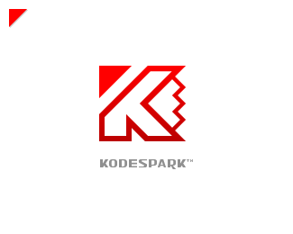
Kodespark
by Kode • Uploaded: Dec. 10 '08

Float
(Floaters:
2 )
Description:
Another variation of my trademark in progress...
I combined the first letter of my nickname "Kode" and my favorite gadget "The pencil".
Can you see the pencil tip?
I would really like some help here guys!
Status:
Nothing set
Viewed:
1764
Share:

Lets Discuss
I read it as KE, thought it was a monogram.
ReplyI'd lose TM for sure, it just confuses things visually. As far as a pencil tip goes - try perhaps losing top and bottom parts of its edges that it shares with K .. i.e. keep right side of K's horizontal lines just floating there unconnected.
ReplyThanks so much for your feedback guys, you have no idea how hard it's been getting to this point of my brand development, it's been over four years!***@itsgareth* I see what you mean!***@epsilon* Tried the floating thing and I just couldn't stand it floating around, as far as the %22TM%22 symbol you are probably right:-)**Would you share your thoughts on the other versions?***Original v1.0* http://logopond.com/gallery/detail/47318***Update v2.0* http://logopond.com/gallery/detail/47323***Update v3.0* This one actually!**-Kode
ReplyWell .. only since you asked :) .. first of all a pencil tip is a great idea and it is a perfect match for the K geometry-wise. I would for this reason try and focus on using negative space, I think it can really be utilized well in your case. Something along these lines (just to illustrate):**!http://graphomania.swapped.cc/tmp/k-symbol-2.png!
Reply*epsilon*, you just scared that crap out of me, I thought your illustration was another logo similar to mine when I first saw the comment:-)**I agree with your comment about the %22k and geometry%22 however, most of the first drafts I came up with included some sort negative space and one of them was exactly like your illustration. The reason why I didn't want to go with it was because the %22less than *%3C*%22 symbol was very predominant and It was bothering me. Plus the separation of the parts just didn't add up, I am sure a lot of *designers* would probably agree with you thought.**-Kode
Replytalented ...Brand !..i am a new viewer ..but a huge fan of all logos !!
ReplyThanks *Shuvro*!
Replygood work, it reminds me to the karspersky logo :)
ReplyThanks man!**You're right, it does look a bit like their logo, the final version is different enough though, I think!
ReplyPlease login/signup to make a comment, registration is easy