Description:
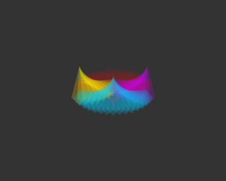
GUI element for "KODESPARK.COM".
CREATIVE SPARKS is the concept of an interface design element for my online portfolio.
I created this element in an effort to describe my portfolio with an image, as part of a branding strategy.
The goal is to create an element for each page on the site and use it as a header to describe that particular page, kinda like, eye candy with purpose if you will!
The concept of this element is the condensed idea I have of my portfolio "Compilation of creative sparks".
I used a colorful group of abstract volcanoes to try to express that idea, with red being the key color (CMY R) because it is Kodespark's official color.
This element will soon be displayed as a header on the homepage of my site, so if you'd like to give me some feedback, that would be great.
As seen on:
Soon @ Kodespark
Status:
Nothing set
Viewed:
1823
Share:

Lets Discuss
Wow dude, this is really cool! I take it the red is replacing the key in CMYK.**When are you gonna put it on the site?
ReplyHey carlos, thanks so much for your kind comment bro!**Yeah, red replaces black. I will put it on the site tonight sometime before midnight, I just gotta get some backend stuff done first.
ReplyThe red gets kind of lost in the back. That being said, its still a pretty cool logo for your portfolio.
ReplyThanks a lot for the float *Jared*!**Actually, this is not the logo for my portfolio, I already have a %22Brand%22:http://logopond.com/gallery/detail/49474 that I'll be using throughout the site, this is merely a design element to represent the portfolio page, which happens to be the homepage as I wanted to display my work right from the get go! Other elements will be created to represent the faq page, contact page and so on.**The name %22Creative Volcano%22 was just the phrase that %22sparked%22 the idea. For example, the element could be displayed below the navigation bar with some clever phrase such as %22The creative sparks of kode%22, which is a more clever way to say %22This is my portfolio%22 IMO anyways!
ReplyOhhh I get it. That's sweet dude. I never read these descriptions close enough, haha. Oh well, awesome idea.
ReplyThanks bro, I appreciate that!***UPDATE* I removed the name from the image, as is just a phrase to identify the idea behind the element and not an actual name! I also increased the size to better judge the effect used! The last change I made was the phrase, from %22Creative Volcano%22 to %22Creative Sparks%22.
ReplyI just added it to the homepage, I would like to know what you guys think!
ReplyI think it looks awesome on there. Your site is really coming together well.
ReplyThanks for checking it out bro, that's really nice of you!**I don't get as much time as I'd like to, to work on it but I really want to make an effort to finish it before the end of January!*
ReplyPlease login/signup to make a comment, registration is easy