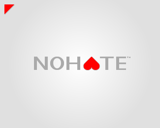
NO HATE (not used)
by Kode • Uploaded: Jan. 04 '09
")
Float
(Floaters:
8 )
Description:
Unused concept for "NOHATE".
NOHATE™ is a human rights, non-profit oranization from Canada.
You're welcome to check out the Final Version
As seen on:
Kodespark
Status:
Nothing set
Viewed:
1926
Share:
Lets Discuss
Hum.. visually looks better and I was actually going to make that suggestion so nice thinking bro.After seeing this I think it works for me anyway, but I think your other idea is equally well worth working on. This one does have strong impact though.
ReplyThis IS good.
ReplyThanks a lot for your help bro, I was kind of happy I was able to work the inverted hart in there!**Will see what other designers have to say, I've been working on this since last year :) So I kinda feel like I've looked at this for way to long!
ReplyAnytime, glad to help , I think either will work. Good luck.
ReplyI feel like the upside down heart is kind of contradictory to %22No Hate%22 and it also looks like kind of a spade to me. Just my opinion. **I just checked out your website - good stuff, you did a nice job on it.
Reply%5E I see your point, but that's what makes this so controversial and have so much impact IMO. What it says is no hate but love. I get it and think the average person can grab the concept.
ReplyIn reality though would be a GREAT logo for HATE :-)
Replysolution! make NO red.
ReplyLike logomotive said, this logo works because it makes a dramatic impact. Great job--you may very well have found your solution %3D)
Replyor maybe not LOL
ReplyVery good point *Jared*, I was just thinking about the %22Spades%22 thing!**The idea about the inverted hart was to illustrate the opposite of %22Love%22 but I can see how it can be seen as a negative thing.**Thanks for checking out my site, I haven't really had time to keep working on it since the holidays, I've given myself a deadline for *01.13.2009* which is my birthday! So, hopefully I'll be able to finish the rest of the site then, I pretty much have everything set up for it I just need to add the content.**I paid your site a visit too and I like the layout and your *Tag Line* is pretty catchy!**
ReplyYeah, unfortunately the tagline is about all I like about it right now, ha. Too much going on to change it though atm.**I see what everyone is saying about how it is controversial. I do think this is a memorable logo, but I'm not sure, I just kind of liked the way you were going with it before.
ReplyThe message is clear. The heart flipped upside down has a very strong impact on the overall look. Fantastic!
ReplyThanks so much for your feedback guys I really appreciate you getting involved!***%5B Logomotive %26 jessepinho %5D* sorry I missed your comments, I must have been writing my comment to *Jared* when you submitted yours. Thanks for your support guys!****%5B Logomotive %5D* You're right mike, this would be the perfect logo for *%22HATE%22*.****%5B lundeja %5D* I think your site looks very professional (smooth color scheme, well designed icons, easy to navigate, creates a fresh atmosphere), I particularly like the forms you put together!***%5B nexqunyx %5D* Thanks so much man!
ReplyWow, this one is genius man!
Reply*%5B carlosrodriguez %5D* Thanks man, that's very nice of you!***%5B Relevant %5D* Thanks for the feedback bro, I personally like this one the best too I just want to make sure no major issues arise you know!
Replythis is brilliant!...
ReplyThanks *nido*, that means a lot to me!
ReplyMy heart just sank! I read NOHATE, but felt NOLOVE. I live in a country that has eleven official languages. Imagine what this visual could do to someone who doesn't speak English. Think about it...
Reply*%5B Black ColourBash %5D* Great point bro!**I feel the logo could be interpreted in many ways by everyone, but I think it would always be around the %22Love, Hate, No Love, No Hate%22 subject. With clever branding to use the logo in the right context, I feel it could be recognized by all or at least people could remember it and tie it to the organization!
ReplyTrue... makes sense. All the best with seeing this one through Kode. I've really watched it evolve over the past couple of days, and I can already see it being a killer!**Great Stuff Man...
ReplyKode, this is the best concept you have so far, I would say this one is the winner and i completely agree with you about the concept of the upside down heart. The only thing I would like to see is maybe a slightly wider type IMO, otherwise perfect!
Reply%5B *Black ColourBash / grabbdesigns* %5D Thanks a lot you guys, I'm really starting to fall in love with this one.**By the way, someone just saw this on my site and it sounds like I'll be developing a dating site logo for them, I'm excited about that :)
Replyi really love this one, man! great work.
ReplyThanks *Justin*, I appreciate that bro!
ReplyPlease login/signup to make a comment, registration is easy