Imageinn V5
by Kode • Uploaded: Jan. 12 '09

Float
(Floaters:
2 )
Description:
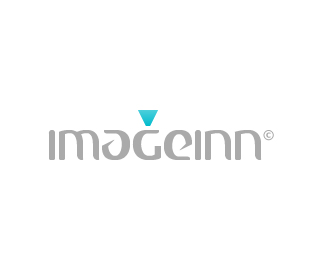
IMAGEINN© is a proprietary printing technology and advanced printing lab.
Slightly updated version, trying to get more legibility out the "i" but retaining the upside down spotlight concept!
Grabbdesigns pointed out to me that the previous version read "mageinn", I tried to address that here but I don't think I'm there yet!
I would really love to get some feedback guys!
As seen on:
Kodespark
Status:
Nothing set
Viewed:
1854
Share:

Lets Discuss
i'm liking this one - still not sure about that i though - now its hard to tell since i now know what it says, i think you need an unbiased opinion now %3B)
ReplyThanks *Brianne*,**I've tried a couple of things to get legibility: adding an ink drop to the bottom of the %22i%22, also tried adding a small gap between the left side of the %22m%22 that forms the %22i%22 and the rest of the %22m%22.**I think I'm gonna have to _bite the bullet_ and add an %22i%22 at the beginning. I just wish I didn't have to do that because it would disrupt the flow and mess up the symmetry and overall concept.***Open to ideas*, this is a work in progress so, feel free to speak your mind!
ReplyIt looks like %22Mage Inn%22 which is a bit of different connotation than you are looking for I believe. In the end the customer has to be able to make it out correctly.
ReplyThanks for letting me know what you see *Trish*, there's a couple of ideas behind the logo I'd like to elaborate on.**I didn't want to explicitly add the %22i%22 to see if I could pull off the legibility while retaining %22Mage%22 which is sometimes used to describe a %22magician or wizard%22 which is how they feel about their technology and printing technique!**Their machines use an upside down *bobbin* in their embroidering for a tighter stitch and the ability to use more than one bobbin thread in a single needle plate. I wanted to add an upside down *spotlight* to illustrate that!***
ReplyThis is a really professional looking logo man, am I the first one to float it?**I like this one better than all the other versions, it did take me a second to figure out the name though, but once I got it I thought the idea was clever!**Roberto told me that the %22a%22 and the %22e%22 were a different style because you wanted to hint at the digital imaging industry by throwing a subliminal to %22Cannon%22, is it true?
ReplySound cool then.
Reply*Carlos*,*Thanks for the float and the nice comment, and yeah it's true about the %22Cannon%22 thing!*Thanks for showing my work to your boss, which in turn got me this project!***Thish*, Thanks for the follow up!***Everyone*, **If you guys are scratching their heads over my conversation with carlosrodriguez, I'd like to shine some light on it!***Carlos*, is an intern at %22Taco Shell Advertising%22 in mexico city and *Roberto* is the creative director he works under!*Carlos showed my work to his boss and they wanted me to design the brand for %22Imageinn%22.
Replynice logo bro**I love this type..**what called this font?
ReplyThanks *Shady*, the font is actually custom! I designed the typeface in illustrator, inspired by one the cannon logos.
ReplyPlease login/signup to make a comment, registration is easy