Description:
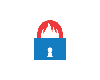
This is for a fire & security company. I'm still working on the type, but I wanted to see what others thought of the icon.
Status:
Work in progress
Viewed:
2203
Share:


Lets Discuss
Interesting mark, but when I first saw it I thought of a cold, snowy, furry creature. The color is disturbing the fire thing. Also, have you tried making the fire on the top, outside the lock, and having the inside smooth?
ReplyThanks for all the helpful criticism! I agree with how the colour conflicts with the fire, so I'll see how it looks in red.**I did think about that actually, putting the fire on top instead. The problem I think there though is then the fire is 'outside' the lock. Here it is contained so long as the lock remains locked. I think it just makes more sense that way to help further communicate the security being provided by the company.**Thanks again for the advice!
ReplyPlease login/signup to make a comment, registration is easy