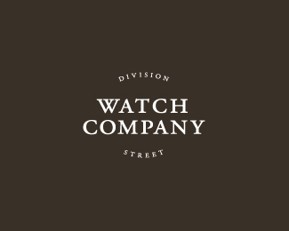
If this had been for a liquor store for example,.. (Division Street Liquor)and made into signage ,it would probably have worked ok. If the name is "Division Street' Watch Co. then perhaps More focus on the name brand. Not too a whole lot of people looking for watches everyday. Just my 2 cents though.
Thanks for the feature! The client specifically requested "Watch Company" be dominant, with "Division Street" coming as secondary type. I myself was perplexed with the request and questioned it. Ultimately, this one didn't go much further and he went in a totally different direction. It's been a couple years since I worked on this, but from what I remember, this was right in line with a mood board that he had sent over. He called for type only, and for it to be elegant as he was selling some pretty pricey watches.
Anyway, thanks for the comments. David, a mixture of all types and styles of well designed logos should be in the gallery, so I think you're doing a fine job there.


Lets Discuss
pretty simple, but simplicity is best in design right?
ReplyI think it's great, I have no trouble envisioning it laser etched onto the back of a watch!!!
ReplyYep, this is nice.
ReplyInteresting to see something like this in gallery.
ReplyObviously simple - its Garamond typed name of the business for goodness sake!
Probably manually kerned here and there, so is that the only thing that could be discussed about it?
I think there's one thing more that I consider as unusual approach to this kind of "firmwriting".
"Division Street" (the actual name of the company) appears like a tagline to "Watch Company"
(which should be business descriptor part of the logo).
That gives some hidden braveness to the whole thing, but...
on the other hand probably because of it went unused.
Division Streets owners probably wanted to give much more impact on the company name than on the business descriptor I guess.
Anyway, nice clean job, and these kind of logos are trending these days don't you think?
^ I agree!
ReplyI also think the W is problematic!
ReplyIf this had been for a liquor store for example,.. (Division Street Liquor)and made into signage ,it would probably have worked ok. If the name is "Division Street' Watch Co. then perhaps More focus on the name brand. Not too a whole lot of people looking for watches everyday. Just my 2 cents though.
Replydidn't even think about that 'W' until now...my eye focusses right in immediately.
ReplyThanks for the feature! The client specifically requested "Watch Company" be dominant, with "Division Street" coming as secondary type. I myself was perplexed with the request and questioned it. Ultimately, this one didn't go much further and he went in a totally different direction. It's been a couple years since I worked on this, but from what I remember, this was right in line with a mood board that he had sent over. He called for type only, and for it to be elegant as he was selling some pretty pricey watches.
ReplyAnyway, thanks for the comments. David, a mixture of all types and styles of well designed logos should be in the gallery, so I think you're doing a fine job there.
Please login/signup to make a comment, registration is easy