Reflections Photography Contest
by IamTiago • Uploaded: Sep. 10 '17

Float
(Floaters:
4 )
Description:
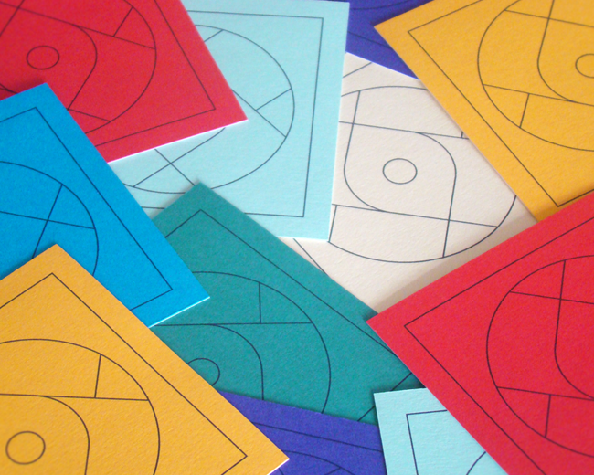
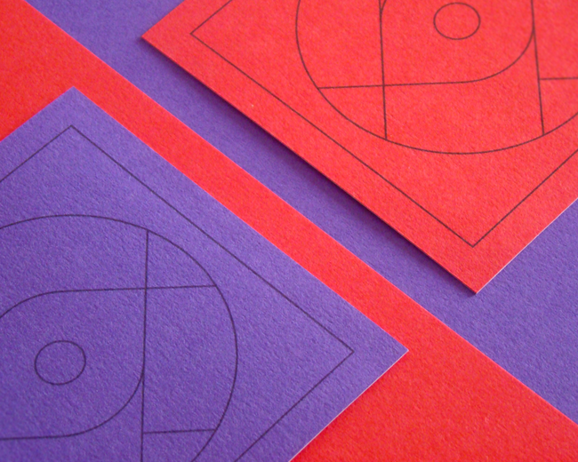
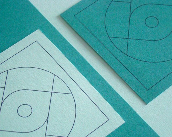
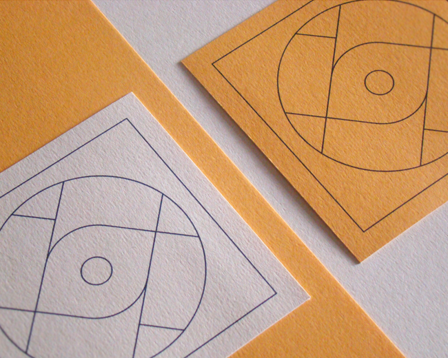
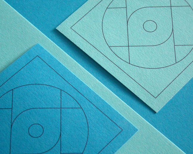
A couple of years back, I was commissioned to create a logo for a photography contest: https://logopond.com/I-am-Tiago/showcase/detail/209927
Now that the contest as run for some time, the client wanted to expand the concept and among some things, an app may end up being developed.
So, in order to prepare for that change (and taking in account the client wanted to keep the same iconography) I focused on improving the wordmark and using a brighter palette.
What do you guys think about it?
Status:
Client work
Viewed:
3,169
Tags:
contest
•
photography
•
app
•
icon
Share:


Lets Discuss
Please login/signup to make a comment, registration is easy