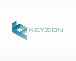
Description:
KeyZion, located in Silicon Valley and Asia-Pacific is an independent information technology company. I have used the idea of a cube as a base to create the letters K & Z. The type is custom
As seen on:
http://www.dache.ch/
Status:
Nothing set
Viewed:
17342
Share:
Lets Discuss
as uasual dache your work is pleasing to the eye %26 very admirable! love the custom font %26 colours used %26 the mark is beautifull!... however (lol)... its the ascender on the 'k' that looks a bit (%26 just a bit) awkward, but maybe i stared at it too long. good stuff mate.
ReplyThats got to be one of the best translucent gradient effect I have seen for a long time! And the custom type, perfect. Compliments each other very well. Another great piece of work David.**Don't worry about my friend nido there. He likes to stare. It just means he's missed his medication, thats all %3B p
ReplyVery nice! Very good combination of translucent effect and lettered shape creation!
ReplyNot your typical 'Dache' style, but still great! Took me a second to see the K and Z...I think that makes it more interesting. Good one, dude!!
ReplyThankyou for the positive feedback.
Replyreally like the balance and the colors. great work
ReplyThanks :)
Replyhow did i miss this ! have to say kick ass .. very nice ....
ReplyThank you, I appreciate it. :)
ReplySmoooth. This is really unique and would be easily brand-able.
ReplyThanks Michael :%5E)
ReplyPlease login/signup to make a comment, registration is easy