Description:
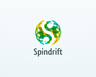
This project came to me from an integrator in the e-commerce space. They provided me with the brief of creating a unique S shape and requested that the 'spin' aspect be incorporated. After creating the S shape with small spinning influences in each curve, I rotated the shape round on itself resulting in a simple spinning S creating an orb-type symbol which gives a really neat solution to the brief given.
As seen on:
http://www.helveticbrands.ch
Status:
Client work
Viewed:
12900
Share:


Lets Discuss
Ah, I just saw the hidden 'S. Great concept.
ReplyWOW! thats too weird, look at my Salt logo. I mean what a coincidence. I guess great minds think a like sometimes.
ReplyLove the color treatment! Good job!
ReplyWow, this logo looks JUST like...**Kidding, dache. Kidding. Straighten those feathers up! I know how you get when people compare your logos to others. I would love to have a few of your high-caliber logos in my portfolio. And would be thrilled to get as many comments -- good or bad -- as you do on here.**Seriously, this is cool, as are so many others in your showcase.
ReplyIm suprised you guys like this ... no disrespect Dache but the white out S lacks your usual finesse ... reminds me of a spirograph rotate s 6 times ...
Reply**smartinup**: Thanks. Yes it was fun :%5E)****OcularInk**: Glad you saw you it.****hackar**: Thanks.****ClimaxDesigns**: Thanks for the gallery spot.****logomotive**: How about that.****sandhya**: Thanks.****rfrusso**: Thanks for the positive feedback.****identego**: There is no capital 'D' in dache. It is a good thing if you think of a spirograph. I think there is just a small error in my presentation, the 'S' is in white on a gradient background so it should be transparent but it is no biggie.
Replyno offence intended .. but good thing, in the presentation its no biggie
ReplyThanks identego %3B%5E)
Replywow, very nice colors!
ReplyThanks
ReplyPlease login/signup to make a comment, registration is easy