K12Reader
by HelveticBrands • Uploaded: Oct. 15 '07 - Gallerized: Oct. '07

Float
(Floaters:
48 )
Description:
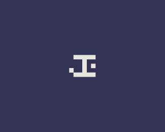
Logo created for a website with articles, ideas, news and tools to help teachers and parents improve reading skills of kids.
As seen on:
http://www.dache.ch
Status:
Nothing set
Viewed:
9900
Share:


Lets Discuss
nice looking, but it would be better if the width of the book would be a little smaller.
ReplyInteresting. On what basis?
Replydache, beautiful work. love the colors. the 12 sections to the book is a really nice touch.
ReplyI like it, but the %22spine%22 feels off-centered to me. It seems you were going for a slight lower-case k alignment, but I think I'd prefer it if the shape of the graphic was vertically symmetrical.**Also, I think the 1-2 pair could be kerned in a little more.**Other than those things, I think it looks good. I like the concept, and I love the colors.
ReplyDache, good idea as usual. maybe you could also add books stacked vertically or create some sort of scroll like fancy book end.The book feels a little large compared to the verticle stroke and feels a little rightside heavy. At least IMO. love the colors.
ReplyThank you for the constructive feedback. Interesting points made.
ReplyIf you have the book mark or some thing like tag, that'll be more elegant, Its my opinion.%0D*%0D*nice mark. I love this.
ReplyPlease login/signup to make a comment, registration is easy