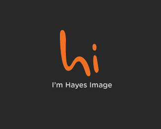
Description:
Hi, I'm Hayes Image. How can I help you?...The first words we say to a friend, stranger, partner, client is 'Hi' - it's that initial greeting that begins our dialogue.
Not only am I opening this dialogue to potential customers & colleagues, but 'Hi' also forms a monogram of my studio name: Hayes Image.
Status:
Unused proposal
Viewed:
12999
Share:
Lets Discuss
I'm liking it. have you thought of designing just a lowercase h with dot above right side? maybe break or not but would also look like dude waving and might make more focus on humm..?more to it than hi. I dunnknow I like this alot just wondered as I always do %3B) I like this approach the best of all you have done.
ReplyThanks Mike :D Drawing up some different variations on this as we speak, I really feel like this the avenue I want to take...so close but yet so far heh :)
Replynot far away at all... I like this idea a lot just always wonder if there is anything more or can be improved upon. I really think your onto something good here. Not that this is bad it's good.. looking forward to your other concepts....Maybe you already got it?
ReplyLove the colors.
ReplyI don't know. The mark is unlikely to work without a tagline. The handwritten text is just too... erm... generic (?). People are basically conditioned to focus on its content and not the styling. Trying to rely on its styling for memorability is a long shot.
ReplyO, hi!*!http://logopond.com/logos/10acaf014b39cf41ff1d06eb33f70d1e.png!:http://logopond.com/gallery/detail/86317
Reply@Mike%3B Yeah got a couple of ideas I'm nearly ready to to move to vector, it's hard to explain, but I sorta want this mark to be as direct as a hammer to a nail... :)%0D*%0D*@Joe%3B Cheers mate :)%0D*%0D*@Alex%3B I see what you mean, but in terms of the 'handrawn' look I think (IMO) is allot more usable the some straight, clinical typeface...that would lose the personal element that I'm going for, but if you have any suggestions, I'm all ears :)%0D*%0D*@Mister Jones%3B ?? Your post is unclear, not sure what you're trying to say...use words.
Replyjust saying hi, Josh. Only need one word to do that :)
ReplyI say, make the 'h' a lower-case one. With a 'swoop' stem....and inside it, %5Bif you can do it so it isn't too cheesy%5D draw a pair of eyes and a smile. That's content to me. And, I agree with epsilon too. In my opinion, it isn't going to do anything for the typical, uneducated client base.
ReplyOR, one other 'smiley face' idea: make it an upper-case 'H', and have the horizontal line curve, like a smile...with two dots above it for eyes. That may be less cheesy, still subtle, and still speak in a friendly manner. Good luck with it.
Reply@Mister Jones%3B hehe Hi, how's things? :)%0D*%0D*@JF%3B Some interesting idea's, I'll be sure to note them down in my sketchbook :)%0D*%0D*Merry Christmas everybody!!
Replynicely done buddy :)
ReplyThanks mate...still playing with it :)
Replylook at this:*http://www.aimelectronics.nl/images/Fabriek_Logo/HI.jpg**Maybe it helps... %3B)
Replybeen watching your logo in other website quite a while! great job! you are a good designer!
ReplyThanks guys!!**I'm still on the fence as to what I want to do this...but stay tuned in :D
Replynever responded on how much I like how this turned out. very friendly and approachable.
ReplyCheers mate :) Conceptually this is where I want to be, just visually I'm a little lost in the woods. I'm totally committed to the 'Hi' idea, just at a loss on how to bring it home :)
Replythis is a brilliant and very clever solution... %22hi%22 right back at ya!
ReplyHi Nido!! Thanks for the comment :)
ReplyFFS - http://www.facebook.com/photo.php?fbid%3D1324938276578%26set%3Da.1520703850595.2075914.1024526574
Reply%5E Offender took the plagarism done :)
Replywell done**and well done
Reply%5E what I mean is both the logo, and getting the logo copycat to take the page down (which I didn't get a chance to see).
ReplyThanks Raj and thanks Raj :D**Can't take all the credit for the work being taken down, he didn't respond to my emails about legal rights, infringement, etc. But responded to the email my GF sent...makes you wonder what was said %3B)
Reply%5E LOOOL
Reply:)
Reply:))
ReplyHi :D
ReplyHi ...... Now that's what we call short and simple ...Great work Mate.
ReplyHi :) Thanks bud, or buds as it would seem. Sometimes all we need is a simple hello.
Replyhello!
ReplyHey! awsm..
ReplyWatsup guys? :)
ReplyThis is very creative! Great job!
ReplyThanks Mark :)
Replynice Hayes
ReplyPlease login/signup to make a comment, registration is easy