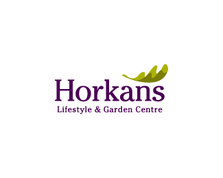
Horkans Lifestyle Centre
by Fogra • Uploaded: Mar. 01 '10 - Gallerized: Mar. '10

Float
(Floaters:
85 )
Description:
This is primarily a premium garden centre which has expanded into other exclusive lifestyle products with the addition of shop units.
Status:
Client work
Viewed:
14607
Share:

Lets Discuss
beautiful type... custom.. nice mark too but maybe a bit bigger?
ReplyWow, very nice Sean! Love it!
ReplyLooks great!%3Cbr%3ELoving the leaf by itself as well!
Replygreat job Mr. O'Grady. Is the type custom? Leaf looks excellent, its like an outstretched hand...
Replynice indeed, I asume that is the 'Cutiful' type?
Replyawesome. love what's going on here. this may be just me, but does the spacing between the %22k%22 and the %22a%22 seem just a tad too far? same as between the %22n%22 and the %22s%22 seems a bit too far also. I am blind in one eye though, so I may be speaking out of turn. Really like this. Also like the leave ob its own. nice work, Sean.
ReplyThanks guys for the feedback. Yeah, the font is 'Cutiful' and I agree that the kerning looks a bit off. I will look at increasing the mark too. Cheers.
ReplyUpdated...
Replynice. which I could float again.
Replybeautiful. nice (life)style :)
ReplyJust a great feel. The relation of the mark to the type is flawless.
ReplyLoving the type. Beautiful.
ReplyType is amazing! Tender%3D)
Replyyummy:D
ReplyVery nice font and colours, Sean.
ReplyMhm..great :)
ReplyThanks all for your kind words and help with this one.
Replylove the type execution Sean, great to see new work from you here
ReplyCheers, Niall.
Replykiller, fogra !
ReplyI don't think the type fits the logo / application personally... it's very nice, but I don't think it provides the proper feel for a 'lifestyle' center. I believe this is Ale Paul's Habano font, no?
Reply@opwancanopie: I should have said in the description that this is primarily a premium garden centre which has expanded into other exclusive lifestyle products with the addition of shop units. The font is 'Cutiful'.**@crislabno: Thanks, Cris.
ReplyGreat logo. Can you send me this font 'Cutiful'? **I would be more than grateful.**aaron@kmvfmedia.com
Reply%5E??? I am sure this guys will gladly send you one http://new.myfonts.com/fonts/typodermic/cutiful/ (but i fear you'll have to return a favor, since it is a commercial font) :)
Reply%5E%5E Good god arronwest, nearly every reply you make you are requesting the font, ya got to buy them like the rest of us dude, if you are stuck for fonts, go to smashing.com, they have plenty of them free....
ReplyCool, makes a lot more sense now. Well done!
ReplyVery classy indeed I wish I was this talented simple and beautiful very clean.
Replyperfect balance, nice work
ReplyThanks people :)
ReplyLove the typography. Goes really well with the mark in this logo.
ReplyPlease login/signup to make a comment, registration is easy