Description:
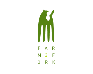
Logo designed for food safety organisation to illustrate food traceability - 'Farm to Fork'. Yes indeed another cow you might say :)
Status:
Nothing set
Viewed:
20661
Share:


Lets Discuss
Nice, original approach Sean. Poor little calf.
ReplyCheers Roy. Anyone for veal?
ReplyNice one Fogra, like the typo treatment here...but, at first sight this mark reminds me on old wooden comb...look here: http://www.woodlandtreasures.co.uk/combs.htm
ReplyCheers Maumer. Wow, the mark really does look like those combs.
Replythis is forking great!
ReplyThis is great, dude. At first I didn't see the cow, but now that I know it's there, I can't miss it. Have you tried taking out a little white space for the left ear? I imagine this will be in the gallery soon. It's a very clever and memorable design. Nice job.
ReplyYou're right, Kevin about the ear and I will definitely try that, thanks.
ReplyThis is a copy of the logo of Gandia Blasco:**http://www.gandiablasco.com**
ReplyA %22copy%22? I don't think so. Similar ideas, but definitely not a %22copy%22.
ReplyRidiculous
ReplyHaha. That's mad. No, I didn't copy. I just happened to do a similar concept. End of.*Thanks guys for your support.
ReplyCome already!!*It is more than an inspiration. Work with concepts realized by another person it seems to me to be painful.*
ReplyNot even close to being a conflict.
Reply@cazador: What is your beef? This text treatment has been done before, granted. The icon is not even remotely similar.
Reply@cazador: If I caused you pain, then I'm truly sorry. Again, as already mentioned, the type treatment is the only similarity.*@Tonfue: You have a great way with words - I bet you write songs and stuff :D
Reply%22Twas a crazy old man called O'Keef *Who caused local farmers much grief *To their cows he would run *Cut their legs off for fun *And say %22Look, I've invented ground beef!%22
ReplyCool, I had a friend once :)
Replythe concept is great, but it took me a couple of minutes to see the cow :(
Replywhere is this ..... cow! hmm my gestalt probably don't let me see it but I like it much anyway.
Replycazador is a vegetarian
ReplyI'll be forked...this is cool!
ReplyLike the idea!
ReplyNice solution!
ReplyAgree -- need to make more white space cut-out to see the other ear. Didn't see a calf/cow until I read comments, sorry to say. Lovely concept, though. Type arrangement you have here is one of my favorite styles.
ReplyP.S.: Looks like Kanye West would be someone who'd love to wear this logo on his hat...type style here, heh heh: http://cdn.buzznet.com/media/jj1/2011/02/kanye-hudgens/vanessa-hudgens-jeremy-scott-show-kanye-west-01.jpg
ReplyI saw a rooster on the left and a rabbit on the right as I tried to see farm related imagery. Great concept, but I think the calf nose and ears can be tweaked. I kind of expect the ears to stick out sideways more. Great idea and very good execution!
Replynice can we play with other color as well
Replygreat solution and interesting layout as well :)
ReplyThanks. Wasn't expecting to see this one in the gallery. I agree that it needs more refinement but it was one of those logos that had to done in a hurry and was created about 10 years ago too.
Replynice to see this in the gallery, Sean. I actually saw the calf first. So it works for me, nicely.
ReplyThanks Mike. Really appreciated.
Replya cow ?a lion:)
ReplyPlease login/signup to make a comment, registration is easy