Description:
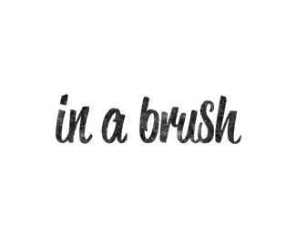
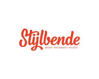
logo-type for my new blog that i just launched today. the blog consists of hand lettering in it’s rawest form; quick shots without the edits.
As seen on:
in a brush
Status:
Client work
Viewed:
6671
Tags:
typography
•
lettering
•
logotype
•
custom
Share:


Lets Discuss
awesome, Conlin.
Replyreally like the look of the blog also, bud. You've been busy.
hey mikey, good to hear that from you. i hope all is well!
ReplyNice Colin!! I like the premise of the blog too :) Love seeing bleed & brush stokes :)
Replynice, cheers Colin!
Replyawesome, glad you guys are liking the idea behind the blog.
Replydavid, i wish that were me writing that! the blog features work of several hand letterers (including some of my own). as always, i appreciate the gallery spot.
Nice Mr. C
Replythank you mr. n
ReplyColin, you already know how much I love this lettering.
Replyi appreciate that, jp. thank you.
Replyvery nice
ReplyVery clean! Feels like word spacing is a tad open IMO
ReplyPlease login/signup to make a comment, registration is easy